Interested in learning ArcPy? check out this course.
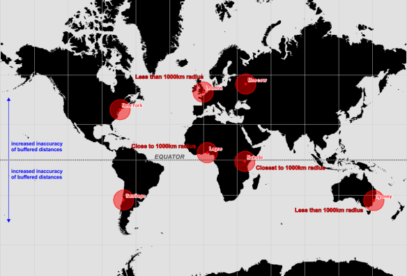
How many of you have looked at a web map with a Google Maps or OpenStreetMap basemap, you know the one where Greenland looks like it’s the size of South America? Recently, I saw one of these maps with buffer zones spread across the United States. Each buffer was the same size indicating that each buffer zone represented a similar sized area of the Earth’s surface, as you’d expect, a 1000km radius buffer zone is a 1000km radius buffer zone! However, if Greenland is looking a similar size to South America, then more than likely the map is displayed using a Web Mercator projection (EPSG: 3857 or 900913) and the further you move away from the equator the more inaccurate and false those same sized 1000km buffer zones become.
Click to enlarge. Web Mercator map with 1000km buffer zone around selected cities.
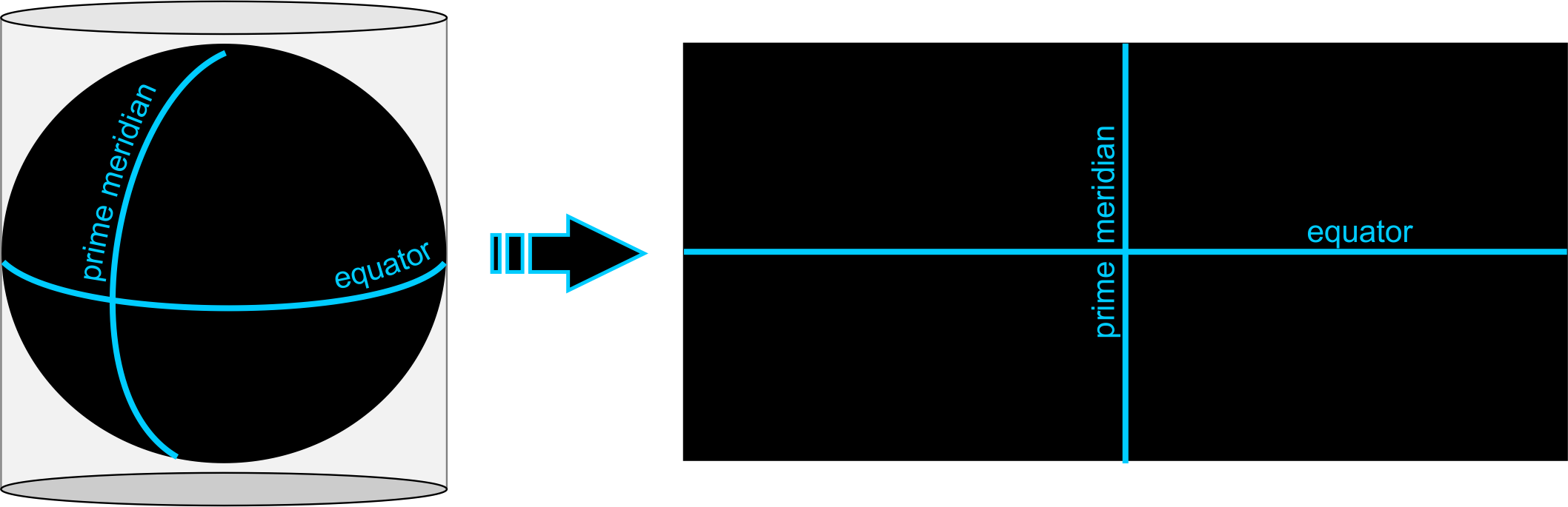
Ok, let’s take a slight step back here for a moment and look at what a projection is. A projection is the mathematical transformation of the Earth to a flat surface. The surface of the Earth is curved, maps are flat so a projected coordinate system begins with projecting an ellipsoidal model of the earth onto a flat plane. Now that we have a flat map we can define locations using Cartesian coordinates with x-axis and y-axis values.
Projection, however, causes distortions in the resulting planar map. These distortions fall into four categories; shape, area, direction, and distance.
Projections that minimize distortions in…
…shape are called conformal projections.
…area are called equal-area projections.
…direction are called true-direction projections.
…distance are called equidistant projections.
The choice of projected coordinate system you choose really boils down to two aspects. The projection should minimalise distortions for your area of interest, but more importantly, if your map requires that a particular spatial property (shape, area, direction, or distance) to be held true, then the projection you choose must preserve that property. It is possible to retain at least one of these properties but not all.
I recently read a book titled “Designing Better Maps” by Cynthia A. Brewer (you would’t know from the maps in this post though) and the following line stood out to me…
“If you see a map of the United States that looks like a rectangular slab, with a straight-line US-Canada border across the west, be suspicious of the mapmaker’s knowledge of map projection and of interpretations of the mapped data.”
This got me thinking about all those maps I see of the United States on a Web Mercator that thematically map data of census tracts or counties of states, or as previously mentioned show buffer zones/distances for visual analysis and/or data analysis purposes. A Mercator is a conformal projection and as such preserves angles (shape as seen by the circles in the figure below) but distorts size and area as you move away from the equator. If focussing on a geographic region as large as the U.S. surely Web Mercator should be avoided at all costs unless the map’s sole purpose is for navigation? A conformal projection should be used for large scale mapping (1:100 000 and larger) centred on the area of interest because at large scales (when using a conformal projection) there are insignificant errors in area and distance.
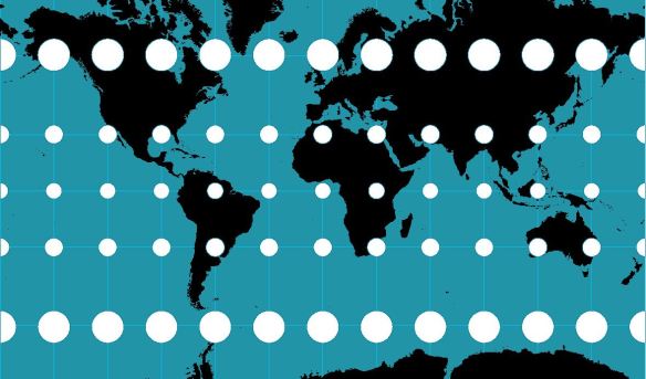
Tissot’s Indicatrix used to display distortions on a Web Mercator
The figure above uses something called the Tissot Indicatrix. Here we have a Web Mercator map, the circles at the equator cover a similar area on the globe as those further north and south of the equator. Hold on, what? Surely those bigger circles towards the poles cover a much larger area on the Earth than those smaller ones at the equator! This is false, but why is this? It is because a Web Mercator is a cylindrical projection system and we will get to this momentarily.
To fit the contiguous United Stated on to an A0 poster you need a scale of around 1:6500000, and 1:27500000 on an A4 page, far from large scale mapping, yet we persist to use the Web Mercator for visualising data for the U.S. on small screens.
UPDATE: the Web Mercator is NON-conformal, please read Roel Nicolai’s comment below and also visit GeoGarage for more information. This post is to make you aware that using the correct projection is paramount for data analysis.
More on Conformal Projections
Conformal projections preserve local shape (and angles) i.e. shape for small areas. Take note that no map projection can preserve shapes for large regions and as such, conformal projections are usually employed for large-scale mapping applications (1:100000 and larger) and rarely used for continental or world maps. Local angles on the sphere are mapped to the same angles in the projection, therefore graticule lines intersect at 90-degree angles. Point to remember: conformity is strictly a local property.
Use a conformal projection when the main purpose of the (large-scale) map involves:
• measuring angles
• measuring local directions accurately
• representing the shapes of features
• representing contour lines
Cylindrical Projection: The Cause for Distortion in a Web Mercator
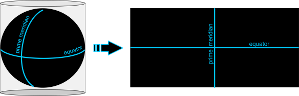
A cylindrical projection (above) is like projecting the earth’s surface on the inside of the tubing and then rolling out the tube to be left with a flat rectangle. In a cylindrical projection world maps are always rectangular in shape. Scale is constant along each parallel (longitude) and meridians (latitude) are equally spaced. The rectangular nature results in all parallels having the same length and all meridians having the same length. But since the real Earth curves in toward the polls, in order to get those straight lines, you have to stretch and distort the surface more and more as you get closer to the north and south poles. In fact, is impossible to see the poles because as you approach them, the distance between latitude lines stretches out toward infinity.
Ruining Life for Web Mercator Buffers
Let’s take a look at an example comparing data on a Web Mercator to a better suited projection for the contiguous U.S.
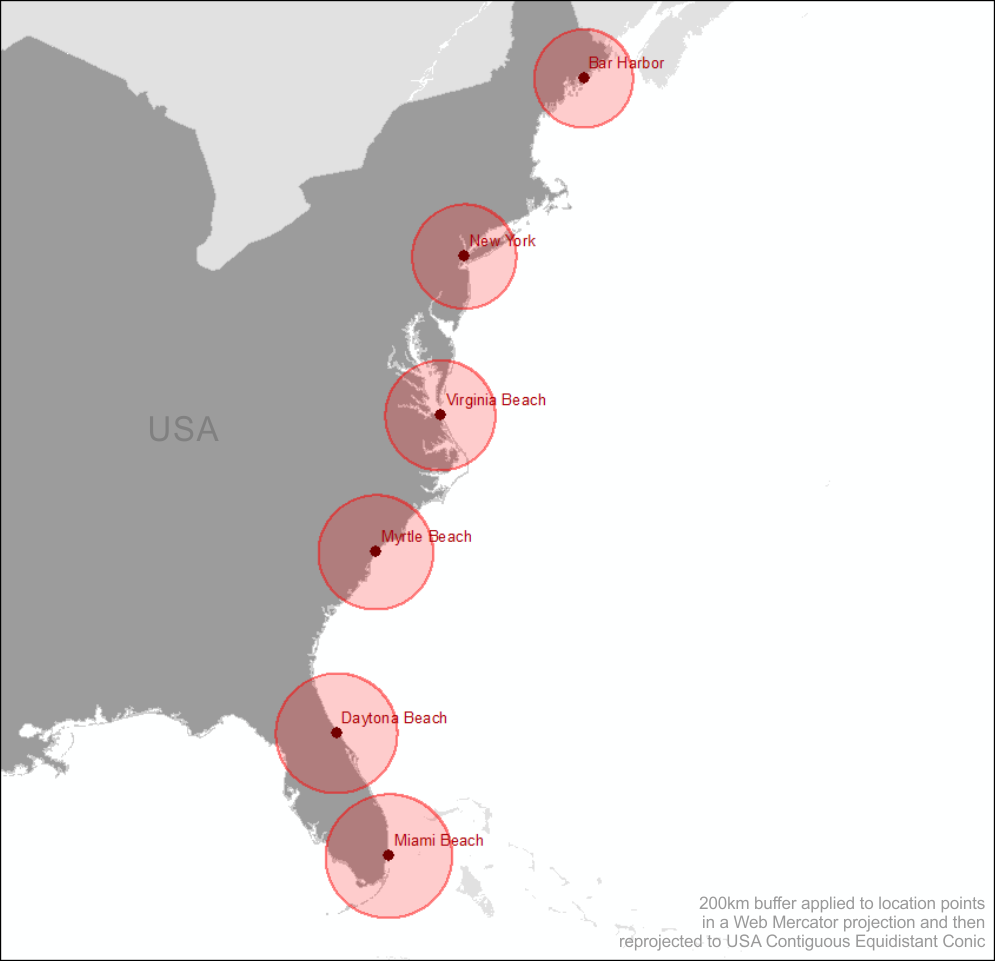
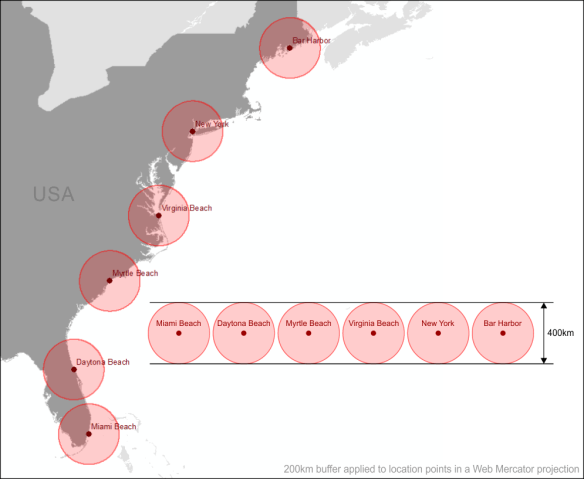
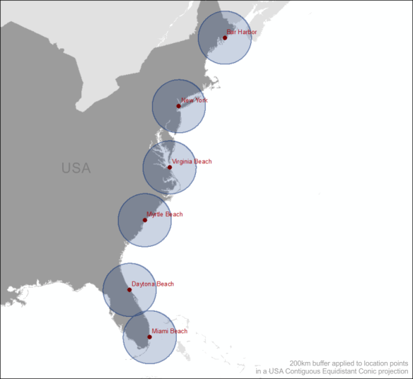
The figure below shows a selection of locations along the east coast of the United States in a Web Mercator projection. A buffer with a radius of 200km has been generated in the Web Mercator projection and applied to each point. We know from the Tissot Indicatrix that circles become enlarged as we move away from the equator but yet the distance of the buffers remains constant as we move from south to north.
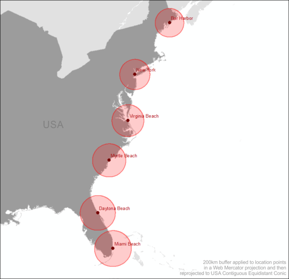
If we convert the entire map to an equidistant projection such as the USA Contiguous Equidistant Conic projection (EPSG: 102005) we will see that the buffer zones will alter and will enlarge as we move from north to south.
So this tells us that the 200km buffer generated in the Web Mercator projection around Bar Harbor (the most northerly location on the map) covers far less an area than the same buffer zone generated for Miami Beach (the most southerly location). This makes sense because of the stretched distortion of the land as we move north from the equator caused by the Web Mercator projection. The buffer zone generated in the Web Mercator projection has not allowed for these distortions.
Now let’s generate the 200km buffer zones in the USA Contiguous Equidistant Conic projection, a projection that attempts to preserve distance.
Similar to the buffer zones created in the Web Mercator each circular zone is the same diameter of 400km. We know that this projection (EPSG: 102005) is designed to preserve distance, so what do you think will happen when we reproject these buffer zones to Web Mercator? Think back to the Tissot Indicatrix figure. That’s right! As we move away from the equator these buffer zones are going to become enlarged as shown in the figure below.
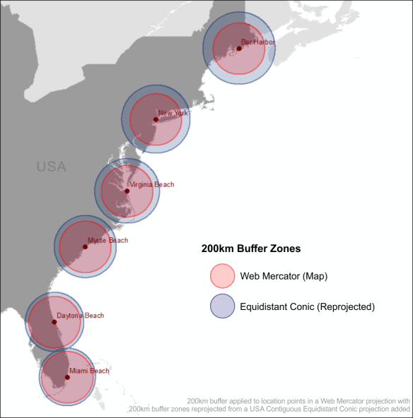
The Equidistant Conic buffer zones in the Web Mercator map above more accurately define a 200km buffer zone around each location than those generated using the Web Mercator projection.
More on Equidistance Projections
Equidistant map projections make the distance from the centre of the projection to any other place on the map uniform in all directions. Take note that no map provides true-to-scale distances for any measurement you might make.
Use an equidistant projection when the main purpose of the map involves similar to; showing distances from the epicentre of an earthquake or other point of location, or mapping the flight routes from one city airport to all destination cities.
How Data Analysis Can Go Wrong
I won’t perform any in-depth analysis but will highlight how performing spatial data analysis using the Web Mercator projection can yield inaccurate results. It is good practice to convert all your data to a common projection when performing geoprocessing and spatial analysis tasks.
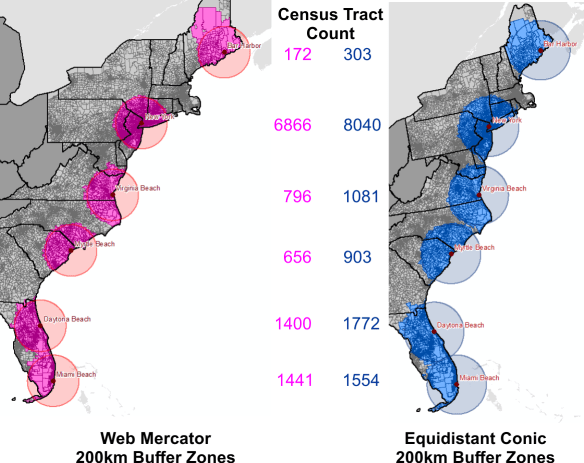
The figure above is a count of the census tracts that intersect the 200km buffer zones of each of the two projections, Web Mercator and USA Contiguous Equidistant Conic. It is easy to see that if you are going to be analysing demographic data based on location around a certain point that the two projections will yield contrasting results. In fact, major contrasting results for most locations. Big decisions are often reliant on spatial analysis. Analysing your data in a non-suited projection system can steer these decisions completely off course, future plans may be scrapped based on the Mercator results, and this decision may have been made in error as the Equidistant Conic results could have shown that the project should have proceeded.
Similarly, if you need to preserve the area of features, such as land parcels for analysis and visual display you might consider an equal-area projection like the USA Contiguous Albers Equal Area Conic projection. Equal-area projections are also essential for dot density mapping, and other density mapping such as population density. Equal-area maps can be used to compare land-masses of the world and finally put to bed that Greenland is a lot smaller than South America.
According to Kenneth Field (a.k.a. the Cartonerd)…
“If you’re going to be comparing areas either for city comparison or for thematics you really do need an equal area projection unless all of your cities sit on the same degree of latitude. If not, you’re literally pulling the wool over the eyes of your map readers and they leave with a totally distorted impression of the themes mapped.”
Check out vis4.net for an example of the Albers Equal Area Conic projection. If Area is important to the underlying data being visualised for the United States, then this is one of the projections you should be using to display your data.
Conclusion
“Projections in a web browser are terrible and you should be ashamed of yourself.” – Calvin Metcalf
If you are using a web portal to perform data analysis through spatial analysis or visual analysis techniques, even if the final visualisation is in Web Mercator, at the very least, make sure that the underlying algorithms churning away in the background producing your output are using the appropriate projection to achieve better accuracy. If you are paying a vendor for their services make sure that their applications are providing you with accurate data analysis for better decision making. You will often here a saying that ‘GIS analysis is only as good as the data used for the analysis’, and while this strongly holds true, the best of data can produce misleading results because of a poor projection choice.
With the ability to produce your own map tiles and JavaScript libraries such as D3.js to overlay vector data in the correct map projection, OpenLayers can also handle projections and there is a Proj4 plugin for Leaflet, and also CartoDB, there are little excuses to allow the dictatorship of the Web Mercator to continue.
But Web Mercator isn’t all that bad. Projections are not important when people are only interested in the relative location of features on a map. So if you are simply dropping location markers on a map without the need for analysing the data, go ahead, use the Web Mercator. But if analysis of data is being performed it is a sin to use the Web Mercator.
P.S. I am still a Mercator sinner when it comes to display. I’m working on my penance.
Sources & Data
ESRI – Tissot Indicatrix Data
ESRI – Distances and Web Mercator
Tiger Geodatabases
Natural Earth Data
Cartonerd
Geo-Hunter
GISC – Slippy Maps
Geography 7
vis4.net – no more mercator
Map Time Boston – Mapping with D3
Calvin Metcalf – FOSS4G
CartoDB – Free Your Maps from Web Mercator