Book Review: The ESRI Guide to GIS Analysis Vol. 2: Spatial Measurements & Statistics

Title: The ESRI Guide to GIS Analysis Vol. 2: Spatial Measurements & Statistics
Author: Andy Mitchell
Publisher: ESRI Press
Year: 2005
Aimed at: GIS/Analysts/Map Designers – intermediate
Purchased from: www.wordery.com

ESRI GA V2

This textbook acts as companion text for GIS Tutorial 2: Spatial Analysis Workbook (for ArcGIS 10.3.x) where you can match up the chapters in each book. Although not a necessity, I would recommend using both texts in tandem to apply the theory and methods discussed with practical tutorials and walkthroughs using ArcGIS. This is the second book of the series and follows on from The ESRI Guide to GIS Analysis Volume 1: Geographic Patterns & Relationships.

The first chapter is, inevitably, an introduction to spatial measurements and statistics. You perform analysis to answer questions and to answer these questions you not only need data but you also need to understand the data. Are you using nominal, ordinal, interval or ratio values, or a combination of these? The type of value(s) will shape the analysis techniques and methods used to calculate the statistics. You will need to interpret the statistics, test their significance and question the results. These elements are briefly visited with the premise of getting more in-depth as the book progresses. The chapter ends with a section on ‘Understanding data distributions’ which is essentially a brief introduction to data exploratory techniques such as describing frequency distributions, spatial distributions, and the presence of outliers and how they can affect analysis.

Chapter 2 discusses measuring geographic distributions with the bulk of the chapter focused on finding the center (mean, meridian, central feature), and measuring compactness (standard distance), orientation and direction of distributions (spatial trends). These are discussed for points, lines, and areal features and also using weighted factors based on attributes. These are useful for adding statistical confidence to patterns derived from a map. Formulas and equations begin to surface and although not necessary to learn them off by heart, because the GIS does all the heavy lifting for you, it gives insight into what goes on under the hood, and knowing the underlying theory and formulas can often aid in troubleshooting and producing accurate analysis. The last section of this chapter is fundamental to the rest of the text, testing statistical significance. This allows you to measure a confidence level for your analysis using the null hypothesis, p-value, and z-score. This can be a difficult topic to comprehend and may require further reading.

The third chapter, a lengthy one, is based around using statistical analysis to identify patterns, to enhance and backup the visual analysis of the map with confidence or to find patterns not may not have been immediately obvious. The human eye will often see patterns that do not really exist, so alternatively, statistical analysis might indicate what you thought was a strong pattern was actually quite weak. The statistical analysis methods are beginning to heat up and here we are introduced to; the Kolmorogov-Smirnov test and Chi Square test for quadrat analysis in identifying patterns in areas of equal size; the nearest neighbour index for calculating the average distance between features and identifying clustering or dispersion; and the K-function as an alternative to the nearest neighbour index, each used to measure the pattern of feature locations. These are followed by measuring the spatial pattern of feature values using; the join count statistic for areas with categories; Geary’s c and Moran’s I for measuring the similarity of nearby features, and the General-G statistic for measuring the concentration of high and low values for features having continuous values. The formulas for each are presented along with testing the significance of and interpreting the results. The final section of this chapter discusses defining spatial neighbourhoods and weights when analysing patterns. There are a few things to consider such as local or regional influences, thresholds of influence, interaction between adjacent features, and the rate of regional decline of influence.

Chapter 4 is titled ‘Identifying Clusters’ with a main focus on hotspot analysis. First, we are introduced to nearest neighbour hierarchical clustering which is heavily used in crime analysis. While Chapter 3 discussed global methods for identifying patterns and returns a single statistic, this chapter focuses on local statistics to show where these patterns exist within the global setting. Geary’s c and Moran’s I both have local versions and their definition, implementation, and factors influencing the results are discussed and critiqued along with Art Getis’ and Keith Ord’s Gi* method for identifying hot and cold spots.While the methods in Chapter 3 enforced that there are patterns in the data (or not), the methods in Chapter 4 highlight where these clustered patterns are. The last section of Chapter 4 discusses using statistics with geographic data; how the very nature of geographic data affects your analysis, how geographic data is represented in a GIS affects your data analysis, the influence of the study area boundary, and GIS data and errors.

“To the extent you’re confident in the quality of your GIS data, you can be confident in the quality of your analysis results.”

The last chapter ventures away from identifying patterns and clusters and focuses on analysing geographic relationships and using statistics to analyse such. Geographic relationships and processes are used to predict where something is likely to occur and examining why things occur where they do. Chapter 5 looks at statistical methods for identifying geographical relationships with a Pearson’s correlation coefficient and Spearman’s correlation coefficient discussed and assessed. Linear regression (ordinary least squares), and geographically weighted regression are presented as methods for analysing geographic processes. These methods warrant a full text in their own right and there is a list of further reading available at the end of the chapter.

Overall Verdict: I feel that I will be referring back to this text a lot. Having recently completed a MSc in Geocomputation I wish that this had crossed my path during the course of my studies and I would highly recommend this book to anyone venturing into spatial analysis where statistics can aid and back up the analysis. Although they are littered throughout the chapters, you really do not need to get bogged down with the formulas behind the statistical analysis techniques, the most important points is that you understand what the methods are performing, their limitations, and how to assess the results and this book really is a fantastic reference for doing just that. Knowing the theory is a huge step to being able to apply the analysis techniques confidently and derive accurate reporting of your data.

Book Review: The ESRI Guide to GIS Analysis Vol. 1: Geographic Patterns & Relationships

Title: The ESRI Guide to GIS Analysis Vol. 1: Geographic Patterns & Relationships
Author: Andy Mitchell
Publisher: ESRI Press
Year: 1999
Aimed at: GIS/Analysts/Map Designers – beginner
Purchased from: www.wordery.com

GIS Analysis Vol 1

This textbook is a companion text for GIS Tutorial 2: Spatial Analysis Workbook (for ArcGIS 10.3.x) where you can match up the chapters in each book. Although not a necessity, I would recommend using both texts in tandem to apply the theory and methods discussed with practical tutorials and walkthroughs using ArcGIS.

The title of this book might lead you to believe that ArcGIS will feature heavily throughout the text but Michael F. Goodchild sets this straight in the Preface by stating that he applauds ESRI for backing this book even though it isn’t Arc eccentric. The author, Andy Mitchell, presents the material as generic GIS such that most GIS software packages should be able to utilise the techniques discussed.

Chapter 1 is a short introduction to what GIS analysis is, understanding the representation of geographic features in a GIS, and the common attributes associated with geographic features that allow for analysis. The wording is simplistic in nature and easy to follow, and acts as a good entrance to the rest of the book.

The second chapter begins to delve into the realm of visual analysis, using your brain to to discern patterns for a better understanding of the data and the area that you are mapping. Several real-life mapped examples are displayed to show how ‘mapping where things are’ aids in more focused decision making. The chapter steps through; deciding what to map, preparing your data, and making your map, with comparison figures to show you why you might perform such tasks.

Why map the most and least? Because mapping features based on quantities adds an additional level of information beyond simply mapping the locations of the features and this notion is made clear from providing some real-life examples in Chapter 3. The author then takes us down a path to understanding quantities and the importance of knowing the type of quantities that you are mapping, and this naturally leads onto the next topic of classification, why use classes? and choosing an appropriate classification method/scheme for the purpose of your data. It is important to understand how classification methods such as Natural Breaks (Jenk’s), Quantile, Equal Interval, and Standard Deviation classify your data and having a general guideline on choosing the appropriate method.

A great recurring aspect in this book is that every chapter begins with a question and Chapter 4’s is ‘Why Map Density?’ and then proceeds to answer the question and the methods available for mapping in a GIS. This chapter discusses density for defined areas, dot density mapping, and density surfaces, what the GIS does to create them and the results of the output.

The fifth chapter takes a look at mapping what’s inside an area, discusses why you would want to map inside an area?, and some analysis and results that can be derived from such. Do you need to map a single area to find what’s happening inside or multiple areas to analyse what’s happening inside each for comparison purposes? Methods are explained along with how the GIS performs these for analysis. You might want to find out if a certain feature is within an area, a list of all features inside an area and a count of each, or the sum of a designated land type area within a boundary for examples. Summaries and statistics can also be generated from what is found inside an area boundary.

Having assessed some simple techniques for mapping what’s inside an area, the next chapter casts it’s attention towards finding what’s nearby. People often think of nearness in straight lines or along transport networks, but GIS is also useful for travel cost analysis giving weight to different land use or soil types for example when considering the path for a pipeline. Nearness by straight-line distance, distance/cost over a network, and cost over a geographic surface are discussed in detail. At this point we are venturing into understanding some of the concepts behind Network Analysis.

The last chapter looks at mapping change with regards to change over time for time pattern analysis. Three ways of mapping change are presented; creating a time series, creating a tracking map, and measuring change, along with the considerations required when creating each type for change in discrete features, events, summarized areas, and continuous categories and values.

Following the last chapter there are some recommendations for some further reading.

Overall Verdict: The perfect companion for a GIS student embarking on their geospatial educational quest. The theory behind GIS is essential for accurate analysis and troubleshooting. This book is an easy read with a plethora of figures and maps utilised in real-life situations found in each chapter to aid in the experience. Although getting closer to being two decades old this text stands the test of time and acts as a solid base for a foundation in simple analysis using a GIS to find patterns and relationships.

The only shortcoming of a text of this nature is that you cannot see how methods and techniques discussed are performed in a GIS. This is where the companion text GIS Tutorial 2: Spatial Analysis Workbook (for ArcGIS 10.3.x) comes in and aids in providing walkthroughs to further enhance your understanding of the underlying theory.

Next: see The ESRI Guide to GIS Analysis Volume 2: Spatial Measurements & Statistics

The Web Mercator Visual and Data Analysis Fallacy

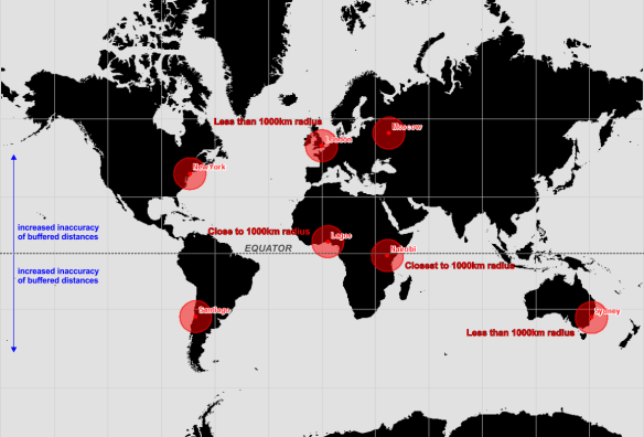
How many of you have looked at a web map with a Google Maps or OpenStreetMap basemap, you know the one where Greenland looks like it’s the size of South America? Recently, I saw one of these maps with buffer zones spread across the United States. Each buffer was the same size indicating that each buffer zone represented a similar sized area of the Earth’s surface, as you’d expect, a 1000km radius buffer zone is a 1000km radius buffer zone! However, if Greenland is looking a similar size to South America, then more than likely the map is displayed using a Web Mercator projection (EPSG: 3857 or 900913) and the further you move away from the equator the more inaccurate and false those same sized 1000km buffer zones become.

Web Mercator

Click to enlarge. Web Mercator map with 1000km buffer zone around selected cities.

Ok, let’s take a slight step back here for a moment and look at what a projection is. A projection is the mathematical transformation of the Earth to a flat surface. The surface of the Earth is curved, maps are flat so a projected coordinate system begins with projecting an ellipsoidal model of the earth onto a flat plane. Now that we have a flat map we can define locations using Cartesian coordinates with x-axis and y-axis values.

Projection, however, causes distortions in the resulting planar map. These distortions fall into four categories; shape, area, direction, and distance.

Projections that minimize distortions in…
…shape are called conformal projections.
…area are called equal-area projections.
…direction are called true-direction projections.
…distance are called equidistant projections.

The choice of projected coordinate system you choose really boils down to two aspects. The projection should minimalise distortions for your area of interest, but more importantly, if your map requires that a particular spatial property (shape, area, direction, or distance) to be held true, then the projection you choose must preserve that property. It is possible to retain at least one of these properties but not all.

I recently read a book titled “Designing Better Maps” by Cynthia A. Brewer (you would’t know from the maps in this post though) and the following line stood out to me…

“If you see a map of the United States that looks like a rectangular slab, with a straight-line US-Canada border across the west, be suspicious of the mapmaker’s knowledge of map projection and of interpretations of the mapped data.”

This got me thinking about all those maps I see of the United States on a Web Mercator that thematically map data of census tracts or counties of states, or as previously mentioned show buffer zones/distances for visual analysis and/or data analysis purposes. A Mercator is a conformal projection and as such preserves angles (shape as seen by the circles in the figure below) but distorts size and area as you move away from the equator. If focussing on a geographic region as large as the U.S. surely Web Mercator should be avoided at all costs unless the map’s sole purpose is for navigation? A conformal projection should be used for large scale mapping (1:100 000 and larger) centred on the area of interest because at large scales (when using a conformal projection) there are insignificant errors in area and distance.

Tissot's Indicatrix WM

Tissot’s Indicatrix used to display distortions on a Web Mercator

The figure above uses something called the Tissot Indicatrix. Here we have a Web Mercator map, the circles at the equator cover a similar area on the globe as those further north and south of the equator. Hold on, what? Surely those bigger circles towards the poles cover a much larger area on the Earth than those smaller ones at the equator! This is false, but why is this? It is because a Web Mercator is a cylindrical projection system and we will get to this momentarily.

To fit the contiguous United Stated on to an A0 poster you need a scale of around 1:6500000, and 1:27500000 on an A4 page, far from large scale mapping, yet we persist to use the Web Mercator for visualising data for the U.S. on small screens.

UPDATE: the Web Mercator is NON-conformal, please read Roel Nicolai’s comment below and also visit GeoGarage for more information. This post is to make you aware that using the correct projection is paramount for data analysis.

More on Conformal Projections

Conformal projections preserve local shape (and angles) i.e. shape for small areas. Take note that no map projection can preserve shapes for large regions and as such, conformal projections are usually employed for large-scale mapping applications (1:100000 and larger) and rarely used for continental or world maps. Local angles on the sphere are mapped to the same angles in the projection, therefore graticule lines intersect at 90-degree angles. Point to remember: conformity is strictly a local property.

Use a conformal projection when the main purpose of the (large-scale) map involves:
• measuring angles
• measuring local directions accurately
• representing the shapes of features
• representing contour lines

Cylindrical Projection: The Cause for Distortion in a Web Mercator

Cylindrical Projection

A cylindrical projection (above) is like projecting the earth’s surface on the inside of the tubing and then rolling out the tube to be left with a flat rectangle. In a cylindrical projection world maps are always rectangular in shape. Scale is constant along each parallel (longitude) and meridians (latitude) are equally spaced. The rectangular nature results in all parallels having the same length and all meridians having the same length. But since the real Earth curves in toward the polls, in order to get those straight lines, you have to stretch and distort the surface more and more as you get closer to the north and south poles. In fact, is impossible to see the poles because as you approach them, the distance between latitude lines stretches out toward infinity.

Ruining Life for Web Mercator Buffers

Let’s take a look at an example comparing data on a Web Mercator to a better suited projection for the contiguous U.S.

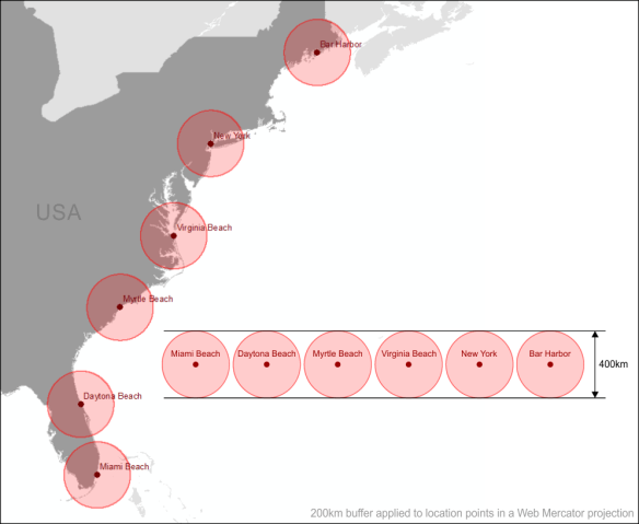
The figure below shows a selection of locations along the east coast of the United States in a Web Mercator projection. A buffer with a radius of 200km has been generated in the Web Mercator projection and applied to each point. We know from the Tissot Indicatrix that circles become enlarged as we move away from the equator but yet the distance of the buffers remains constant as we move from south to north.

Web Mercator Buffers

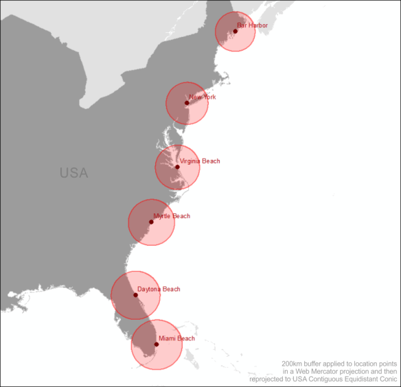
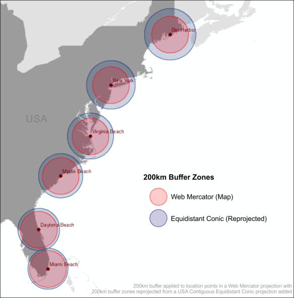
If we convert the entire map to an equidistant projection such as the USA Contiguous Equidistant Conic projection (EPSG: 102005) we will see that the buffer zones will alter and will enlarge as we move from north to south.

Web Mercator Buffers Reprojected

So this tells us that the 200km buffer generated in the Web Mercator projection around Bar Harbor (the most northerly location on the map) covers far less an area than the same buffer zone generated for Miami Beach (the most southerly location). This makes sense because of the stretched distortion of the land as we move north from the equator caused by the Web Mercator projection. The buffer zone generated in the Web Mercator projection has not allowed for these distortions.

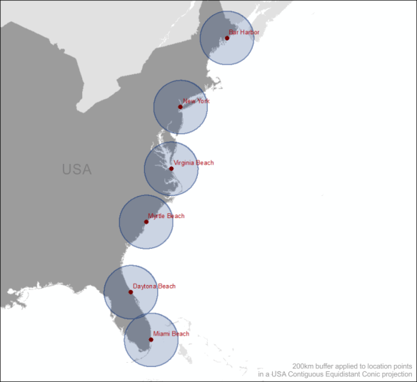
Now let’s generate the 200km buffer zones in the USA Contiguous Equidistant Conic projection, a projection that attempts to preserve distance.

Equidistant Buffers

Similar to the buffer zones created in the Web Mercator each circular zone is the same diameter of 400km. We know that this projection (EPSG: 102005) is designed to preserve distance, so what do you think will happen when we reproject these buffer zones to Web Mercator? Think back to the Tissot Indicatrix figure. That’s right! As we move away from the equator these buffer zones are going to become enlarged as shown in the figure below.

Equidistant Buffers Reprojected

The Equidistant Conic buffer zones in the Web Mercator map above more accurately define a 200km buffer zone around each location than those generated using the Web Mercator projection.

More on Equidistance Projections

Equidistant map projections make the distance from the centre of the projection to any other place on the map uniform in all directions. Take note that no map provides true-to-scale distances for any measurement you might make.

Use an equidistant projection when the main purpose of the map involves similar to; showing distances from the epicentre of an earthquake or other point of location, or mapping the flight routes from one city airport to all destination cities.

How Data Analysis Can Go Wrong

I won’t perform any in-depth analysis but will highlight how performing spatial data analysis using the Web Mercator projection can yield inaccurate results. It is good practice to convert all your data to a common projection when performing geoprocessing and spatial analysis tasks.

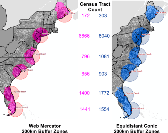
Census Tract Counts

The figure above is a count of the census tracts that intersect the 200km buffer zones of each of the two projections, Web Mercator and USA Contiguous Equidistant Conic. It is easy to see that if you are going to be analysing demographic data based on location around a certain point that the two projections will yield contrasting results. In fact, major contrasting results for most locations. Big decisions are often reliant on spatial analysis. Analysing your data in a non-suited projection system can steer these decisions completely off course, future plans may be scrapped based on the Mercator results, and this decision may have been made in error as the Equidistant Conic results could have shown that the project should have proceeded.

Similarly, if you need to preserve the area of features, such as land parcels for analysis and visual display you might consider an equal-area projection like the USA Contiguous Albers Equal Area Conic projection. Equal-area projections are also essential for dot density mapping, and other density mapping such as population density. Equal-area maps can be used to compare land-masses of the world and finally put to bed that Greenland is a lot smaller than South America.

According to Kenneth Field (a.k.a. the Cartonerd)…

“If you’re going to be comparing areas either for city comparison or for thematics you really do need an equal area projection unless all of your cities sit on the same degree of latitude. If not, you’re literally pulling the wool over the eyes of your map readers and they leave with a totally distorted impression of the themes mapped.”

Check out vis4.net for an example of the Albers Equal Area Conic projection. If Area is important to the underlying data being visualised for the United States, then this is one of the projections you should be using to display your data.

Conclusion

“Projections in a web browser are terrible and you should be ashamed of yourself.” – Calvin Metcalf

If you are using a web portal to perform data analysis through spatial analysis or visual analysis techniques, even if the final visualisation is in Web Mercator, at the very least, make sure that the underlying algorithms churning away in the background producing your output are using the appropriate projection to achieve better accuracy. If you are paying a vendor for their services make sure that their applications are providing you with accurate data analysis for better decision making. You will often here a saying that ‘GIS analysis is only as good as the data used for the analysis’, and while this strongly holds true, the best of data can produce misleading results because of a poor projection choice.

With the ability to produce your own map tiles and JavaScript libraries such as D3.js to overlay vector data in the correct map projection, OpenLayers can also handle projections and there is a Proj4 plugin for Leaflet, and also CartoDB, there are little excuses to allow the dictatorship of the Web Mercator to continue.

But Web Mercator isn’t all that bad. Projections are not important when people are only interested in the relative location of features on a map. So if you are simply dropping location markers on a map without the need for analysing the data, go ahead, use the Web Mercator. But if analysis of data is being performed it is a sin to use the Web Mercator.

P.S. I am still a Mercator sinner when it comes to display. I’m working on my penance.

Sources & Data

ESRI – Tissot Indicatrix Data
ESRI – Distances and Web Mercator
Tiger Geodatabases
Natural Earth Data
Cartonerd
Geo-Hunter
GISC – Slippy Maps
Geography 7
vis4.net – no more mercator
Map Time Boston – Mapping with D3
Calvin Metcalf – FOSS4G
CartoDB – Free Your Maps from Web Mercator