OSGP: Measuring Geographic Distributions – Central Feature

This blog post has found a new home at Final Draft Mapping.

(Open Source Geospatial Python)

The ‘What is it?’

The Central Feature is the point that is the shortest distance to all other points in the dataset and thus identifies the most centrally located feature. The Central Feature can be used to find the most accessible feature, for example, the most accessible school to hold a training day for teachers from schools in a given area.

The Formula!

For each feature calculate the total distance to all other features. The feature that has the shortest total distance is the Central Feature.

For Point features the X and Y coordinates of each feature is used, for Polygons the centroid of each feature represents the X and Y coordinate to use, and for Linear features the mid-point of each line is used for the X and Y coordinate

The Code…

from osgeo import ogr
from shapely.geometry import MultiLineString
from shapely import wkt
import numpy as np

## set the driver for the data
driver = ogr.GetDriverByName("FileGDB")
## path to the FileGDB
gdb = r"C:\Users\Glen B\Documents\my_geodata.gdb"
## open the GDB in write mode (1)
ds = driver.Open(gdb, 1)

## input layer
input_lyr_name = "Birmingham_Secondary_Schools"

## output layer
output_fc = "{0}_central_feature".format(input_lyr_name)

## reference the layer using the layers name
if input_lyr_name in [ds.GetLayerByIndex(lyr_name).GetName() for lyr_name in range(ds.GetLayerCount())]:
    lyr = ds.GetLayerByName(input_lyr_name)
    print "{0} found in {1}".format(input_lyr_name, gdb)

## delete the output layer if it already exists
if output_fc in [ds.GetLayerByIndex(lyr_name).GetName() for lyr_name in range(ds.GetLayerCount())]:
    ds.DeleteLayer(output_fc)
    print "Deleting: {0}".format(output_fc)

## for each point or polygon in the layer
## get the x and y value of the centroid
## and add them into a numpy array
try:
    first_feat = lyr.GetFeature(1)
    if first_feat.geometry().GetGeometryName() in ["POINT", "MULTIPOINT", "POLYGON", "MULTIPOLYGON"]:
        xy_arr = np.ndarray((len(lyr), 2), dtype=np.float)
        for i, pt in enumerate(lyr):
            ft_geom = pt.geometry()
            xy_arr[i] = (ft_geom.Centroid().GetX(), ft_geom.Centroid().GetY())

    ## for linear features we get the midpoint of a line
    elif first_feat.geometry().GetGeometryName() in ["LINESTRING", "MULTILINESTRING"]:
        xy_arr = np.ndarray((len(lyr), 2), dtype=np.float)
        for i, ln in enumerate(lyr):
            line_geom = ln.geometry().ExportToWkt()
            shapely_line = MultiLineString(wkt.loads(line_geom))
            midpoint = shapely_line.interpolate(shapely_line.length/2)
            xy_arr[i] = (midpoint.x, midpoint.y)

## exit gracefully if unknown geometry or input contains no geometry
except Exception:
    print "Unknown Geometry for {0}".format(input_lyr_name)

## construct NxN array, this will be the distance matrix
pt_dist_arr = np.ndarray((len(xy_arr), len(xy_arr)), dtype=np.float)

## fill the distance array
for i, a in enumerate(xy_arr):
    for j, b in enumerate(xy_arr):
        pt_dist_arr[i,j] = np.linalg.norm(a-b)

## sum distances for each point
summed_distances = np.sum(pt_dist_arr, axis=0)

## index of point with minimum summed distances
index_central_feat = np.argmin(summed_distances)

## position of the point with min distance
central_x, central_y = xy_arr[index_central_feat]

print "Central Feature Coords: {0}, {1}".format(central_x, central_y)

## create a new point layer with the same spatial ref as lyr
out_lyr = ds.CreateLayer(output_fc, lyr.GetSpatialRef(), ogr.wkbPoint)

## define and create new fields
x_fld = ogr.FieldDefn("X", ogr.OFTReal)
y_fld = ogr.FieldDefn("Y", ogr.OFTReal)
out_lyr.CreateField(x_fld)
out_lyr.CreateField(y_fld)

## create a new point for the mean center
pnt = ogr.Geometry(ogr.wkbPoint)
pnt.AddPoint(central_x, central_y)

## add the mean center to the new layer
feat_dfn = out_lyr.GetLayerDefn()
feat = ogr.Feature(feat_dfn)
feat.SetGeometry(pnt)
feat.SetField("X", central_x)
feat.SetField("Y", central_y)
out_lyr.CreateFeature(feat)

print "Created: {0}".format(output_fc)

## free up resources
del ds, lyr, first_feat, feat, out_lyr

I’d like to give credit to Logan Byers from GIS StackExchange who aided in speeding up the computational time using NumPy and for forcing me to begin learning the wonders of NumPy.

At the moment this is significantly slower that performing the same process with ArcGIS for 20,000+ features, but more rapid for a lower amount. 1,000 features processed in 3 seconds.

The Example:

I downloaded vector data that contains polygons for schools from OS Open Map – Local that covered the West Midlands. I also downloaded OS Boundary Line data. Using Python and GDAL/OGR I extracted secondary schools from the data for Birmingham. Everything was now in place to find the Central Feature of all Secondary Schools for Birmingham. (see The Other Scripts section at the bottom of this post for processing the data)

birmingham_secondary_schools

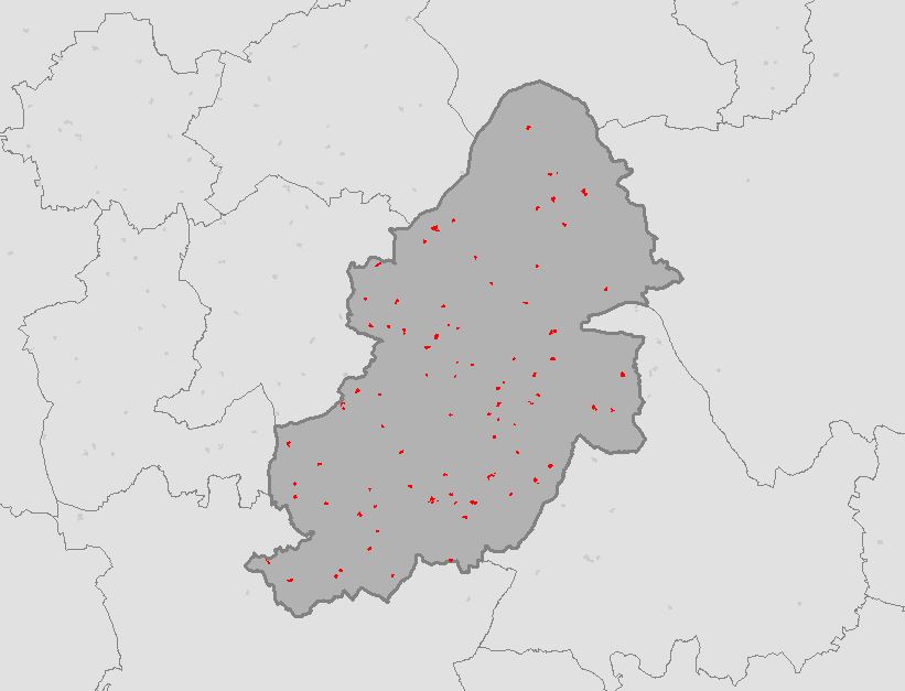
Running the script from The Code section above calculates the coordinates of the Central Feature for all Secondary Schools and creates a point feature class in the File GDB.

birmingham_secondary_schools_central_feature

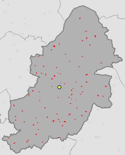
OSGP Central Feature:      407726.185, 287215.1
ArcGIS Central Feature:    407726.185, 287215.1

What’s Next?

Median Center (link will be updated once post is complete)

Also see…

Mean Center

The Resources:

ESRI Guide to GIS Volume 2: Chapter 2 (I highly recommend this book)
see book review here.

Geoprocessing with Python

Python GDAL/OGR Cookbook

Setting up GDAL/OGR with FileGDB Driver for Python on Windows

< The Other Scripts >

Birmingham Secondary Schools

from osgeo import ogr
import os

## necessary drivers
shp_driver = ogr.GetDriverByName("ESRI Shapefile")
gdb_driver = ogr.GetDriverByName("FileGDB")

## input boundary shapefile and file reference file gdb
shapefile = r"C:\Users\Glen B\Documents\Schools\Data\GB\district_borough_unitary_region.shp"
gdb = r"C:\Users\Glen B\Documents\my_geodata.gdb"

shp_ds = shp_driver.Open(shapefile, 0)
gdb_ds = gdb_driver.Open(gdb, 1)

## filter boundary to just Birmingham
shp_layer = shp_ds.GetLayer(0)
shp_layer.SetAttributeFilter("NAME = 'Birmingham District (B)'")

## name the output
output_fc = "Birmingham_Secondary_Schools"

## if the output feature class already exists then delete it
if output_fc in [gdb_ds.GetLayerByIndex(lyr_name).GetName() for lyr_name in range(gdb_ds.GetLayerCount())]:
    gdb_ds.DeleteLayer(output_fc)
    print "Deleting: {0}".format(output_fc)

## create the output feature class
out_lyr = gdb_ds.CreateLayer(output_fc, shp_layer.GetSpatialRef(), ogr.wkbPolygon)

## the folder that contains the data to extract Secondary Schools from
root_folder = r"C:\Users\Glen B\Documents\Schools\Vector\data"

## traverse through the folders and find ImportantBuildings files
## copy only those that intersect the Birmingham region
## transfer across attributes
count = 1
for root,dirs,files in os.walk(root_folder):
    for filename in files:
        if filename.endswith("ImportantBuilding.shp") and filename[0:2] in ["SP", "SO", "SJ", "SK"]:
            shp_path = "{0}\\{1}".format(root, filename)
            schools_ds = shp_driver.Open(shp_path, 0)
            schools_lyr = schools_ds.GetLayer(0)
            schools_lyr.SetAttributeFilter("CLASSIFICA = 'Secondary Education'")
            lyr_def = schools_lyr.GetLayerDefn()
            if count == 1:
                for i in range(lyr_def.GetFieldCount()):
                    out_lyr.CreateField(lyr_def.GetFieldDefn(i))
                count += 1
            shp_layer.ResetReading()
            for shp_feat in shp_layer:
                birm_geom = shp_feat.GetGeometryRef()

                for school_feat in schools_lyr:
                    school_geom = school_feat.GetGeometryRef()

                    if school_geom.Intersects(birm_geom):
                        feat_dfn = out_lyr.GetLayerDefn()
                        feat = ogr.Feature(feat_dfn)
                        feat.SetGeometry(school_geom)
                        for i in range(lyr_def.GetFieldCount()):
                            feat.SetField(lyr_def.GetFieldDefn(i).GetNameRef(), school_feat.GetField(i))

                        out_lyr.CreateFeature(feat)
                        feat.Destroy()

del shp_ds, shp_layer, gdb_ds

The Usual 🙂

As always please feel free to comment to help make the code more efficient, highlight errors, or let me know if this was of any use to you.

Table or Feature Class Attributes to CSV with ArcPy (Python)

Here’s a little function for exporting an attribute table from ArcGIS to a CSV file. The function takes two arguments, these are a file-path to the input feature class or table and a file-path for the output CSV file (see example down further).

First import the necessary modules.

import arcpy, csv

Inside the function we use ArcPy to get a list of the field names.

def tableToCSV(input_tbl, csv_filepath):
    fld_list = arcpy.ListFields(input_tbl)
    fld_names = [fld.name for fld in fld_list]

We then open a CSV file to write the data to.

    with open(csv_filepath, 'wb') as csv_file:
        writer = csv.writer(csv_file)

The first row of the output CSV file contains the header which is the list of field names.

        writer.writerow(fld_names)

We then use the ArcPy SearchCursor to access the attributes in the table for each row and write each row to the output CSV file.

        with arcpy.da.SearchCursor(input_tbl, fld_names) as cursor:
            for row in cursor:
                writer.writerow(row)

And close the CSV file.

    csv_file.close()

Full script example…

import arcpy, csv

def tableToCSV(input_tbl, csv_filepath):
    fld_list = arcpy.ListFields(input_tbl)
    fld_names = [fld.name for fld in fld_list]
    with open(csv_filepath, 'wb') as csv_file:
        writer = csv.writer(csv_file)
        writer.writerow(fld_names)
        with arcpy.da.SearchCursor(input_tbl, fld_names) as cursor:
            for row in cursor:
                writer.writerow(row)
        print csv_filepath + " CREATED"
    csv_file.close()

fc = r"C:\Users\******\Documents\ArcGIS\Default.gdb\my_fc"
out_csv = r"C:\Users\******\Documents\output_file.csv"

tableToCSV(fc, out_csv)

Feel free to ask questions, comment, or help build upon this example.

Book Review: The ESRI Guide to GIS Analysis Vol. 2: Spatial Measurements & Statistics

Title: The ESRI Guide to GIS Analysis Vol. 2: Spatial Measurements & Statistics
Author: Andy Mitchell
Publisher: ESRI Press
Year: 2005
Aimed at: GIS/Analysts/Map Designers – intermediate
Purchased from: www.wordery.com

ESRI GA V2

This textbook acts as companion text for GIS Tutorial 2: Spatial Analysis Workbook (for ArcGIS 10.3.x) where you can match up the chapters in each book. Although not a necessity, I would recommend using both texts in tandem to apply the theory and methods discussed with practical tutorials and walkthroughs using ArcGIS. This is the second book of the series and follows on from The ESRI Guide to GIS Analysis Volume 1: Geographic Patterns & Relationships.

The first chapter is, inevitably, an introduction to spatial measurements and statistics. You perform analysis to answer questions and to answer these questions you not only need data but you also need to understand the data. Are you using nominal, ordinal, interval or ratio values, or a combination of these? The type of value(s) will shape the analysis techniques and methods used to calculate the statistics. You will need to interpret the statistics, test their significance and question the results. These elements are briefly visited with the premise of getting more in-depth as the book progresses. The chapter ends with a section on ‘Understanding data distributions’ which is essentially a brief introduction to data exploratory techniques such as describing frequency distributions, spatial distributions, and the presence of outliers and how they can affect analysis.

Chapter 2 discusses measuring geographic distributions with the bulk of the chapter focused on finding the center (mean, meridian, central feature), and measuring compactness (standard distance), orientation and direction of distributions (spatial trends). These are discussed for points, lines, and areal features and also using weighted factors based on attributes. These are useful for adding statistical confidence to patterns derived from a map. Formulas and equations begin to surface and although not necessary to learn them off by heart, because the GIS does all the heavy lifting for you, it gives insight into what goes on under the hood, and knowing the underlying theory and formulas can often aid in troubleshooting and producing accurate analysis. The last section of this chapter is fundamental to the rest of the text, testing statistical significance. This allows you to measure a confidence level for your analysis using the null hypothesis, p-value, and z-score. This can be a difficult topic to comprehend and may require further reading.

The third chapter, a lengthy one, is based around using statistical analysis to identify patterns, to enhance and backup the visual analysis of the map with confidence or to find patterns not may not have been immediately obvious. The human eye will often see patterns that do not really exist, so alternatively, statistical analysis might indicate what you thought was a strong pattern was actually quite weak. The statistical analysis methods are beginning to heat up and here we are introduced to; the Kolmorogov-Smirnov test and Chi Square test for quadrat analysis in identifying patterns in areas of equal size; the nearest neighbour index for calculating the average distance between features and identifying clustering or dispersion; and the K-function as an alternative to the nearest neighbour index, each used to measure the pattern of feature locations. These are followed by measuring the spatial pattern of feature values using; the join count statistic for areas with categories; Geary’s c and Moran’s I for measuring the similarity of nearby features, and the General-G statistic for measuring the concentration of high and low values for features having continuous values. The formulas for each are presented along with testing the significance of and interpreting the results. The final section of this chapter discusses defining spatial neighbourhoods and weights when analysing patterns. There are a few things to consider such as local or regional influences, thresholds of influence, interaction between adjacent features, and the rate of regional decline of influence.

Chapter 4 is titled ‘Identifying Clusters’ with a main focus on hotspot analysis. First, we are introduced to nearest neighbour hierarchical clustering which is heavily used in crime analysis. While Chapter 3 discussed global methods for identifying patterns and returns a single statistic, this chapter focuses on local statistics to show where these patterns exist within the global setting. Geary’s c and Moran’s I both have local versions and their definition, implementation, and factors influencing the results are discussed and critiqued along with Art Getis’ and Keith Ord’s Gi* method for identifying hot and cold spots.While the methods in Chapter 3 enforced that there are patterns in the data (or not), the methods in Chapter 4 highlight where these clustered patterns are. The last section of Chapter 4 discusses using statistics with geographic data; how the very nature of geographic data affects your analysis, how geographic data is represented in a GIS affects your data analysis, the influence of the study area boundary, and GIS data and errors.

“To the extent you’re confident in the quality of your GIS data, you can be confident in the quality of your analysis results.”

The last chapter ventures away from identifying patterns and clusters and focuses on analysing geographic relationships and using statistics to analyse such. Geographic relationships and processes are used to predict where something is likely to occur and examining why things occur where they do. Chapter 5 looks at statistical methods for identifying geographical relationships with a Pearson’s correlation coefficient and Spearman’s correlation coefficient discussed and assessed. Linear regression (ordinary least squares), and geographically weighted regression are presented as methods for analysing geographic processes. These methods warrant a full text in their own right and there is a list of further reading available at the end of the chapter.

Overall Verdict: I feel that I will be referring back to this text a lot. Having recently completed a MSc in Geocomputation I wish that this had crossed my path during the course of my studies and I would highly recommend this book to anyone venturing into spatial analysis where statistics can aid and back up the analysis. Although they are littered throughout the chapters, you really do not need to get bogged down with the formulas behind the statistical analysis techniques, the most important points is that you understand what the methods are performing, their limitations, and how to assess the results and this book really is a fantastic reference for doing just that. Knowing the theory is a huge step to being able to apply the analysis techniques confidently and derive accurate reporting of your data.

Book Review: Learning ArcGIS Geodatabases [eBook]

Title: Learning ArcGIS Geodatabases
Author: Hussein Nasser
Publisher: Packt Publishing
Year: 2014
Aimed at: ArcGIS – beginner to advanced
Purchased from: www.packtpub.com

Learning ArcGIS Geodatabases

After using MapInfo for four years my familiarity with ArcGIS severely declined. The last time I utilised ArcGIS in employment shapefiles were predominantly used but I knew geodatabases were the way forward. If they were going to play a big part in future employment it made sense to get more intimate with them and learn their inner secrets. This compact eBook seemed like a good place to start…

The first chapter is short and sweet and delivered at a beginner’s level with nice point to point walkthroughs and screenshots to make sure you are following correctly. You are briefed on how to design, author, and edit a geodatabase. The design process involves designing the schema and specifying the field names, data types, and the geometry types for the feature class you wish to create. This logical design is then implemented as a physical schema within the file geodatabase. Finally, we add data to the geodatabase through the use of editing tools in ArcGIS and assign attribute data for each feature created. Very simple stuff so far that provides a foundation for getting set-up for the rest of the book.

The second chapter is a lot bulkier and builds upon the first. The initial task in Chapter 2 is to add new attributes to the feature classes followed by altering field properties to suit requirements. You are introduced to domains, designed to help you reduce errors while creating features and preserve data integrity, and subtypes. We are shown how to create a relationship class so we can link one feature in a spatial dataset to multiple records in a non-spatial table stored in the geodatabase as an object table. The next venture in this chapter takes a quick look at converting labels to an annotation class before ending with importing other datasets such as shapefiles, CAD files, and coverage classes and integrating them into the geodatabase as a single point of spatial reference for a project.

Chapter 3 looks at improving the rough and ready design of the geodatabase through entity-relationship modelling, which is a logical diagram of the geodatabase that shows relationships in the data. It is used to reduce the cost of future maintenance. Most of the steps from the first two chapters are revisited as we are taken through creating a geodatabase based on the new entity relationship model. The new model reduces the number of feature classes and improves efficiency through domains, subtypes and relationship classes. Besides a new train of thought on modelling a geodatabase for simplicity the only new technical feature presented in the chapter is enabling attachments in the feature class. It is important to test the design of the geodatabases through ArcGIS, testing includes adding a feature, making use of the domains and subtypes, and test the attachment capabilities to make sure that your set-up works as it should.

Chapter 4 begins with the premise of optimizing geodatabases through tuning tools. Three key optimizing features are discussed; indexing, compressing, and compacting. The simplicity of the first three chapters dwindles and we enter a more intermediate realm. For indexing, how to enable attribute indexing and spatial indexing in ArcGIS is discussed along with using indexes effectively. Many of you may have heard about database indexing before, but the concept of compression and compacting in a database may be foreign. These concepts are explored and their effective implementation explained.

The first part of the fifth chapter steps away from the GUI of ArcGIS for Desktop and ArcCatalog and switches to Python programming for geodatabase tasks. Although laden with simplicity, if you have absolutely no experience with programming or knowledge of the general concepts well then this chapter may be beyond your comprehension, but I would suggest performing the walkthroughs as it might give you an appetite for future programming endeavours. We are shown how to programmatically create a file geodatabase, add fields, delete fields, and make a copy of a feature class to another feature class. All this is achieved through Python using the arcpy module. Although aimed at highlighting the integration of programming with geodatabase creation and maintenance the author also highlights how programming and automation improves efficiency.

The second part of the chapter provides an alternative to using programming for geoprocessing automation in the form of the Model Builder. The walkthrough shows us how to use the Model Builder to build a simple model to create a file geodatabase and add a feature class to it.

The final chapter steps up a level from file geodatabases to enterprise geodatabases.

“An enterprise geodatabase is a geodatabase that is built and configured on top of a powerful relational database management system. These geodatabases are designed for multiple users operating simultaneously over a network.”

The author walks us through installing Microsoft SQL Server Express and lists some of the benefits of employing an enterprise geodatabase system. Once the installation is complete the next step is to connect to the database from a local and remote machine. Once connections are established and tested an enterprise geodatabase can be created to and its functionality utilised. You can also migrate a file geodatabase to and enterprise geodatabase. The last part of Chapter 6 shows how privileges can be used to grant users access to data that you have created or deny them access. Security is an integral part of database management.

Overall Verdict: for such a compact eBook (158 pages) it packs a decent amount of information that provides good value for money, and it also introduces other learning ventures that come part and parcel with databases in general and therefore geodatabases. Many of the sections could be expanded based on their material but the pagination would then increase into many hundreds (and more) and beyond the scope of this book. The author, Hussein Nasser, does a great job with limiting the focus to the workings of geodatabases and not veering off on any unnecessary tangents. I would recommend using complimentary material to bolster your knowledge with regards to many of the aspects such as entity-relationship diagrams, indexing (both spatial and non-spatial), Python programming, the Model Builder, enterprise geodatabases and anything else you found interesting that was only briefly touched on. Overall the text is a foundation for easing your way into geodatabase life, especially if shapefiles are still the centre of you GIS data universe.

The Web Mercator Visual and Data Analysis Fallacy

Interested in learning ArcPy? check out this course.

How many of you have looked at a web map with a Google Maps or OpenStreetMap basemap, you know the one where Greenland looks like it’s the size of South America? Recently, I saw one of these maps with buffer zones spread across the United States. Each buffer was the same size indicating that each buffer zone represented a similar sized area of the Earth’s surface, as you’d expect, a 1000km radius buffer zone is a 1000km radius buffer zone! However, if Greenland is looking a similar size to South America, then more than likely the map is displayed using a Web Mercator projection (EPSG: 3857 or 900913) and the further you move away from the equator the more inaccurate and false those same sized 1000km buffer zones become.

Web Mercator

Click to enlarge. Web Mercator map with 1000km buffer zone around selected cities.

Ok, let’s take a slight step back here for a moment and look at what a projection is. A projection is the mathematical transformation of the Earth to a flat surface. The surface of the Earth is curved, maps are flat so a projected coordinate system begins with projecting an ellipsoidal model of the earth onto a flat plane. Now that we have a flat map we can define locations using Cartesian coordinates with x-axis and y-axis values.

Projection, however, causes distortions in the resulting planar map. These distortions fall into four categories; shape, area, direction, and distance.

Projections that minimize distortions in…
…shape are called conformal projections.
…area are called equal-area projections.
…direction are called true-direction projections.
…distance are called equidistant projections.

The choice of projected coordinate system you choose really boils down to two aspects. The projection should minimalise distortions for your area of interest, but more importantly, if your map requires that a particular spatial property (shape, area, direction, or distance) to be held true, then the projection you choose must preserve that property. It is possible to retain at least one of these properties but not all.

I recently read a book titled “Designing Better Maps” by Cynthia A. Brewer (you would’t know from the maps in this post though) and the following line stood out to me…

“If you see a map of the United States that looks like a rectangular slab, with a straight-line US-Canada border across the west, be suspicious of the mapmaker’s knowledge of map projection and of interpretations of the mapped data.”

This got me thinking about all those maps I see of the United States on a Web Mercator that thematically map data of census tracts or counties of states, or as previously mentioned show buffer zones/distances for visual analysis and/or data analysis purposes. A Mercator is a conformal projection and as such preserves angles (shape as seen by the circles in the figure below) but distorts size and area as you move away from the equator. If focussing on a geographic region as large as the U.S. surely Web Mercator should be avoided at all costs unless the map’s sole purpose is for navigation? A conformal projection should be used for large scale mapping (1:100 000 and larger) centred on the area of interest because at large scales (when using a conformal projection) there are insignificant errors in area and distance.

Tissot's Indicatrix WM

Tissot’s Indicatrix used to display distortions on a Web Mercator

The figure above uses something called the Tissot Indicatrix. Here we have a Web Mercator map, the circles at the equator cover a similar area on the globe as those further north and south of the equator. Hold on, what? Surely those bigger circles towards the poles cover a much larger area on the Earth than those smaller ones at the equator! This is false, but why is this? It is because a Web Mercator is a cylindrical projection system and we will get to this momentarily.

To fit the contiguous United Stated on to an A0 poster you need a scale of around 1:6500000, and 1:27500000 on an A4 page, far from large scale mapping, yet we persist to use the Web Mercator for visualising data for the U.S. on small screens.

UPDATE: the Web Mercator is NON-conformal, please read Roel Nicolai’s comment below and also visit GeoGarage for more information. This post is to make you aware that using the correct projection is paramount for data analysis.

More on Conformal Projections

Conformal projections preserve local shape (and angles) i.e. shape for small areas. Take note that no map projection can preserve shapes for large regions and as such, conformal projections are usually employed for large-scale mapping applications (1:100000 and larger) and rarely used for continental or world maps. Local angles on the sphere are mapped to the same angles in the projection, therefore graticule lines intersect at 90-degree angles. Point to remember: conformity is strictly a local property.

Use a conformal projection when the main purpose of the (large-scale) map involves:
• measuring angles
• measuring local directions accurately
• representing the shapes of features
• representing contour lines

Cylindrical Projection: The Cause for Distortion in a Web Mercator

Cylindrical Projection

A cylindrical projection (above) is like projecting the earth’s surface on the inside of the tubing and then rolling out the tube to be left with a flat rectangle. In a cylindrical projection world maps are always rectangular in shape. Scale is constant along each parallel (longitude) and meridians (latitude) are equally spaced. The rectangular nature results in all parallels having the same length and all meridians having the same length. But since the real Earth curves in toward the polls, in order to get those straight lines, you have to stretch and distort the surface more and more as you get closer to the north and south poles. In fact, is impossible to see the poles because as you approach them, the distance between latitude lines stretches out toward infinity.

Ruining Life for Web Mercator Buffers

Let’s take a look at an example comparing data on a Web Mercator to a better suited projection for the contiguous U.S.

The figure below shows a selection of locations along the east coast of the United States in a Web Mercator projection. A buffer with a radius of 200km has been generated in the Web Mercator projection and applied to each point. We know from the Tissot Indicatrix that circles become enlarged as we move away from the equator but yet the distance of the buffers remains constant as we move from south to north.

Web Mercator Buffers

If we convert the entire map to an equidistant projection such as the USA Contiguous Equidistant Conic projection (EPSG: 102005) we will see that the buffer zones will alter and will enlarge as we move from north to south.

Web Mercator Buffers Reprojected

So this tells us that the 200km buffer generated in the Web Mercator projection around Bar Harbor (the most northerly location on the map) covers far less an area than the same buffer zone generated for Miami Beach (the most southerly location). This makes sense because of the stretched distortion of the land as we move north from the equator caused by the Web Mercator projection. The buffer zone generated in the Web Mercator projection has not allowed for these distortions.

Now let’s generate the 200km buffer zones in the USA Contiguous Equidistant Conic projection, a projection that attempts to preserve distance.

Equidistant Buffers

Similar to the buffer zones created in the Web Mercator each circular zone is the same diameter of 400km. We know that this projection (EPSG: 102005) is designed to preserve distance, so what do you think will happen when we reproject these buffer zones to Web Mercator? Think back to the Tissot Indicatrix figure. That’s right! As we move away from the equator these buffer zones are going to become enlarged as shown in the figure below.

Equidistant Buffers Reprojected

The Equidistant Conic buffer zones in the Web Mercator map above more accurately define a 200km buffer zone around each location than those generated using the Web Mercator projection.

More on Equidistance Projections

Equidistant map projections make the distance from the centre of the projection to any other place on the map uniform in all directions. Take note that no map provides true-to-scale distances for any measurement you might make.

Use an equidistant projection when the main purpose of the map involves similar to; showing distances from the epicentre of an earthquake or other point of location, or mapping the flight routes from one city airport to all destination cities.

How Data Analysis Can Go Wrong

I won’t perform any in-depth analysis but will highlight how performing spatial data analysis using the Web Mercator projection can yield inaccurate results. It is good practice to convert all your data to a common projection when performing geoprocessing and spatial analysis tasks.

Census Tract Counts

The figure above is a count of the census tracts that intersect the 200km buffer zones of each of the two projections, Web Mercator and USA Contiguous Equidistant Conic. It is easy to see that if you are going to be analysing demographic data based on location around a certain point that the two projections will yield contrasting results. In fact, major contrasting results for most locations. Big decisions are often reliant on spatial analysis. Analysing your data in a non-suited projection system can steer these decisions completely off course, future plans may be scrapped based on the Mercator results, and this decision may have been made in error as the Equidistant Conic results could have shown that the project should have proceeded.

Similarly, if you need to preserve the area of features, such as land parcels for analysis and visual display you might consider an equal-area projection like the USA Contiguous Albers Equal Area Conic projection. Equal-area projections are also essential for dot density mapping, and other density mapping such as population density. Equal-area maps can be used to compare land-masses of the world and finally put to bed that Greenland is a lot smaller than South America.

According to Kenneth Field (a.k.a. the Cartonerd)…

“If you’re going to be comparing areas either for city comparison or for thematics you really do need an equal area projection unless all of your cities sit on the same degree of latitude. If not, you’re literally pulling the wool over the eyes of your map readers and they leave with a totally distorted impression of the themes mapped.”

Check out vis4.net for an example of the Albers Equal Area Conic projection. If Area is important to the underlying data being visualised for the United States, then this is one of the projections you should be using to display your data.

Conclusion

“Projections in a web browser are terrible and you should be ashamed of yourself.” – Calvin Metcalf

If you are using a web portal to perform data analysis through spatial analysis or visual analysis techniques, even if the final visualisation is in Web Mercator, at the very least, make sure that the underlying algorithms churning away in the background producing your output are using the appropriate projection to achieve better accuracy. If you are paying a vendor for their services make sure that their applications are providing you with accurate data analysis for better decision making. You will often here a saying that ‘GIS analysis is only as good as the data used for the analysis’, and while this strongly holds true, the best of data can produce misleading results because of a poor projection choice.

With the ability to produce your own map tiles and JavaScript libraries such as D3.js to overlay vector data in the correct map projection, OpenLayers can also handle projections and there is a Proj4 plugin for Leaflet, and also CartoDB, there are little excuses to allow the dictatorship of the Web Mercator to continue.

But Web Mercator isn’t all that bad. Projections are not important when people are only interested in the relative location of features on a map. So if you are simply dropping location markers on a map without the need for analysing the data, go ahead, use the Web Mercator. But if analysis of data is being performed it is a sin to use the Web Mercator.

P.S. I am still a Mercator sinner when it comes to display. I’m working on my penance.

Sources & Data

ESRI – Tissot Indicatrix Data
ESRI – Distances and Web Mercator
Tiger Geodatabases
Natural Earth Data
Cartonerd
Geo-Hunter
GISC – Slippy Maps
Geography 7
vis4.net – no more mercator
Map Time Boston – Mapping with D3
Calvin Metcalf – FOSS4G
CartoDB – Free Your Maps from Web Mercator