[An Introduction to] Hotspot Analysis Using ArcGIS

Interested in learning ArcPy? check out this course.

Make sure to read the What is Hotspot Analysis? post before proceeding with this tutorial. This tutorial will serve as an introduction to hotspot analysis with ArcGIS Desktop. You will find links at the bottom of the post that will provide information for further research.

Get the Data

It is often difficult to find real data for use with tutorials so first of all a hat tip to Eric Pimpler, the author of ArcGIS Blueprints, for pointing me towards accessing crime data for Seattle. To follow this tutorial you will need the neighborhoods of Seattle Shapefile which you can download from here and burglary data for 2015 which I have provided a link to here. Use the Project tool from Data Management Tools > Projections and Transformations to project the data into a Projected Coordinate System. For this tutorial I have used UTM Zone 10N. Open, view and if you want style the data in ArcMap.

HSA Vector Data

Spatial Autocorrelation: Is there clustering?

The presence of spatial clustering in the data is a requisite for hotspot analysis. Moran’s I is a measure of spatial autocorrelation that returns a value ranging from -1 to 1. Perfect dispersion at -1, complete random arrangement at 0, and a north/south divide at +1 indicating perfect correlation.

Moran's I Visual

For statistical hypothesis testing, Moran’s I value can be transformed to a z-zcore in which values greater than 1.96 or smaller than -1.96 indicate spatial autocorrelation that is significant at the 5% level.

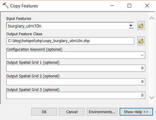
We first need to prepare the data. At the moment each point represent one incident, we need to aggregate the data in some way so that each feature has an attribute with a value in a range. Open the Copy Features tool from Data Management Tools > Features. Create a copy of the burglary point layer. Run the tool and add the new layer to the map.

Copy Features Tool

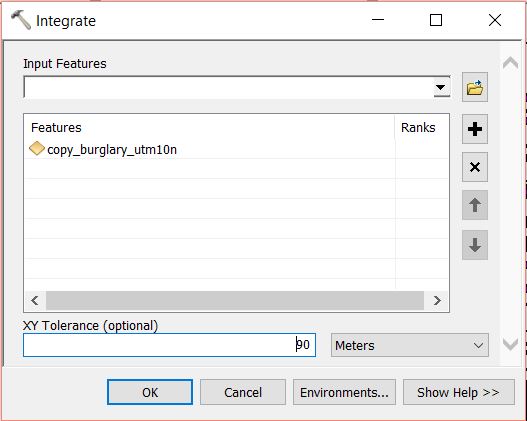
Open the Integrate tool from Data Managemant Tools > Feature Class. Select the copy of the burglary layer as the Input Features and set an XY Tolerance of 90 or 100 meters. Run the tool. This will relocate points within 90m (or 100m) or whatever you set in XY Tolerance field, of each other and stack them on top of one another.

Integrate Tool

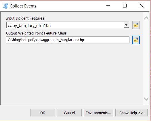
At this moment each point sits on top of another. We need to merge coincident points and make a count of how many were merged at each point. Open the Collect Events tool from Spatial Statistics Tools > Utilities. Set the copy of the burglary layer as the Input Incident Features and set a filepath and name for the Output Weighted Point Feature Class. Run the tool.

Collect Events Tool

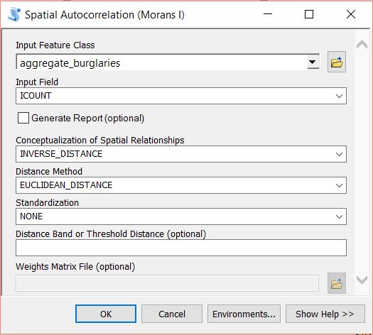
The data will be added to the map with graduated symbols, however, we are interested in running further analysis using Moran’s I. If you open the attribute table for the layer you will see a field has been added called ICOUNT. This field holds the count of cooincident points from the Intergrate layer. Open the Spatial Autocorrelation (Moran’s I) from Spatial Statistics Tools > Analyzing Patterns. Set the aggregated burglary layer as the Input Feature Class and ICOUNT as the Input Field. I have left the default setting for the other parameters (see below).

Spatial Autocorrelation Tool

Run the tool by clicking on OK. A summary will display with statistical findings.

Moran's I Values

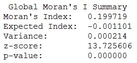
We return a value close to 0.2 and a high z-score. This indicates that clustering exists within the data for high positive values. We are now confident that clustering exists within the dataset and can continue with performing the hotspot analysis.

Optimized Hotspot Analysis

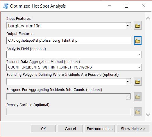
Remove all layers from map the except the two original layers with the burglary data and the neighborhoods. From the Toolbox navigate to Spatial Statistics Tools > Mapping Clusters and open the Optimized Hotspot Analysis tool. This tool allows for quick hotspot analysis using minimal input parameters and sets/calculates default parameters for those you have no control over. For more control over the statistical elements you can use the Hotspot Analysis (Getis-Ord GI*) tool. For now we will use the optimized approach.

Set the burglary points as the Input Features, name your Output Features (here I have named them ohsa_burg_plygns), select COUNT_INCIDENTS_WITHIN_AGGREGATION_POLYGONS for the Incident Data Aggregation Method and choose the neighborhoods features for the Polygons For Aggregating Incidents Into Counts.

Optimized HSA - Polygons

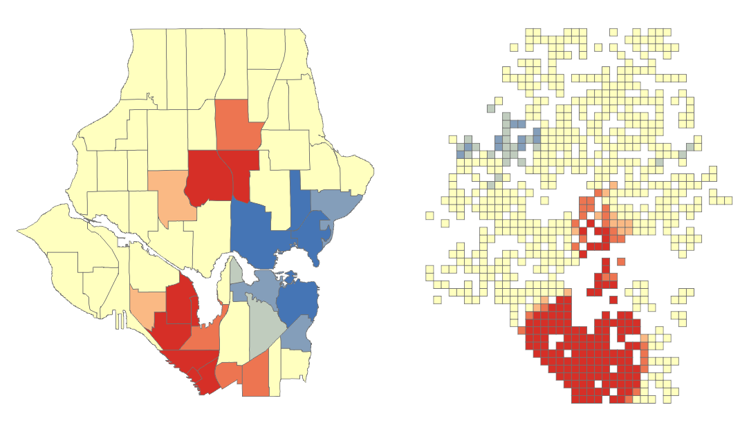
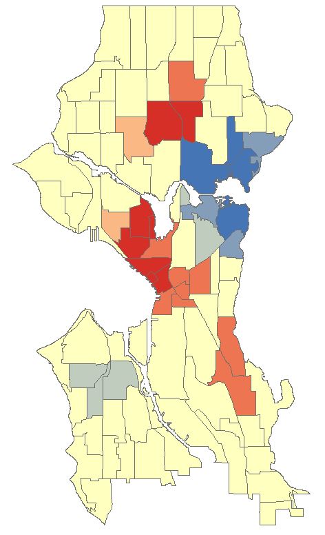
OHSA: Aggregating Point Data to Polygon Features

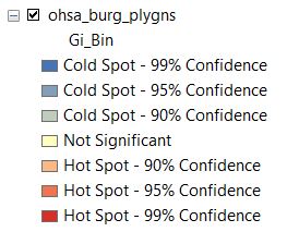
Click OK to run the tool. The ohsa_burg_plygns layer will automatically be added as a layer to the map, if not, add it and turn off all other layers. So what has happened here? The tool has aggregated the point data into the neighborhood polygons. If you open the attribute table for the newly created layer you will see a field names Count_Join which is a count of burglaries per neighborhood. A z-score and a p-score is calculated which enables the detection of hot and cold spots in the data. Remember, a high z-score and a low p-value for a feature indicates a significant hotspot. A low negative z-score and a small p-value indicates a significant cold spot. The higher (or lower) the z-score, the more intense the clustering. A z-score near 0 means no spatial clustering.

HSA Attribute Table

The Gi_Bin field classifies the data into a range from -3 (Cold Spot – 99% Confidence) to 3 (Hot Spot – 99% Confidence), with 0 being non-significant, just take a look at your Table of Contents.

Optimized - Confidence Levels

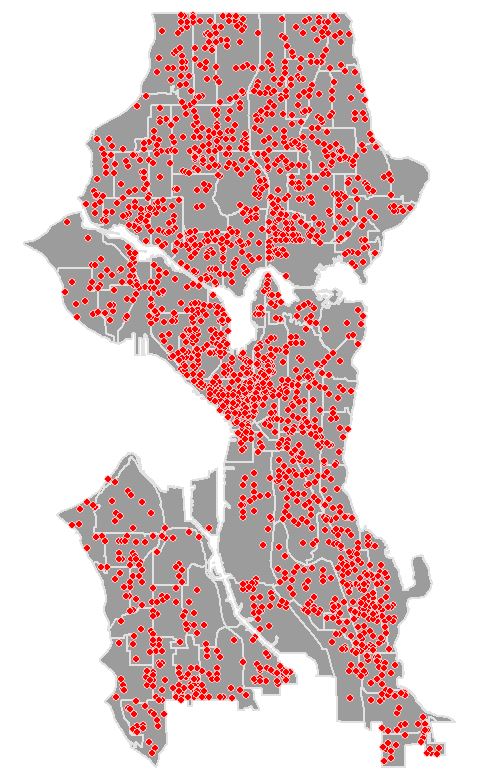
The map should look similar to below. There are several neighborhoods that are statistically significant hotspots. It is important to note that you may need to factor in other data or normalise your data to refine results. Some of the neighborhoods might be densely populated with suburban housing while in others housing may be sparse and bordering towards rural. This may affect findings and you may need to create ratios before analysing. We won’t delve into this here as this tutorial is introductory level (and because I don’t have the data to do so).

OHSA Polygon Map

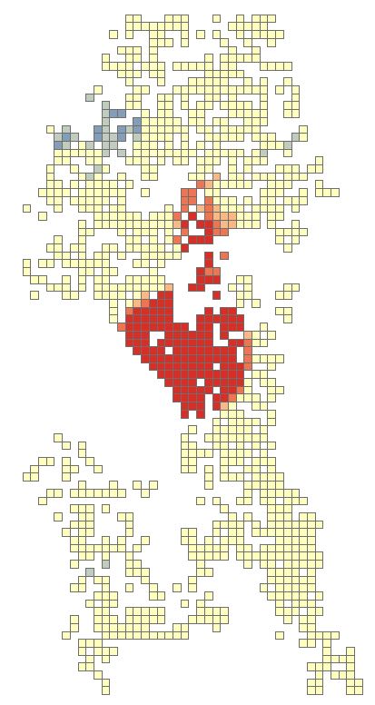
OHSA: Aggregating Point Data to Fishnet Features

Close any attribute tables and turn off all layers in your map. Re-open the Optimized Hotspot Analysis tool and set the input as seen below. This time we will create a fishnet/grid to aggregate the point data to.

Optimized - Fishnet

Click OK to run the tool. The tool removes any locational outliers, calculates a cell size, and aggregates the point data to the cells in the grid. Similar to aggregating to polygons the fishnet attribute table will have a join count, z-score, p-score and bin value with the same confidence levels.

OHSA Fishnet MapShould attention be entirely focused on the red areas? Copy the fishnet layer and paste it into the data frame. Rename the copy as fishnet_count. Open the properties and navigate to the Symbology tab. Change the Value field to Join_Count, reduce the Classes to 5 and set the classification to Equal Count. Click OK.

Fishnet SymbologyThere will be one red cell and one light red cell in the northern half of the map. Use the zoom tool to zoom-in closer to both features. Turn on the labels for the feature for the Join_Count attribute. Notice that the light-red cell has a count of 19 but in the Hotspot Analysis this was a non-significant area. With the second highest burglary count for a 300m x 300m area surely this area requires some attention. Perhaps all areas outside of significant hotspots with values greater that 15 are a priority? I am not a expert in crime analysis so I’ll leave it up to those sleuth’s.

OHSA Fishnet Labels

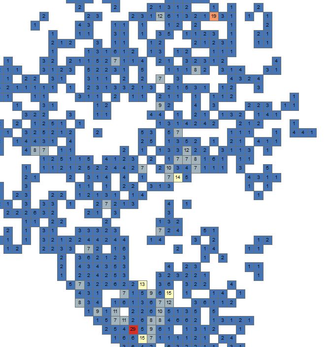
This just serves to note to make sure that you use all the analysis techniques at your disposal from simple to more advanced, from visual and labels to statistical.

OHSA: Create Weighted Points by Snapping Nearby Incidents

Zoom out to the full extent of the neighborhoods layer and turn off all layers in the map. Re-open the Optimized Hotspot Analysis tool and set the input as seen below. Notice this time we will also create a Density Surface.

Optimized - Points

Click OK and run the tool. The tool calculates a distance value and converges points that fall within that distance in relation to each other. It then runs the hotspot analysis similar to the previous two examples producing an attribute table with an ICOUNT field, z-score, p-score and bin value for confidence level. The ICOUNT field denotes how many incidents the one point references.

OHSA Points Map

Let’s clip the density raster to the neighborhoods layer. Open the Clip tool from Data Management Tools > Raster > Raster Processing. Set the Input Raster as the density raster, use the neighborhoods layer as the Output Extent, make sure Use Input Features for Clipping Geometry is checked, set and name the Output Raster Dataset.

Density Raster Clip

Click OK and run the tool. Add the newly created raster to the map if it hasn’t automatically been added. Make it the only visible layer. Open the properties for the layer and go to the Symbology tab. Select Classified and generate a histogram if asked to. Change the Classes to 7 and the colour ramp to match previous colour schemes. You might need to flip the colour  ramp to achieve this.

Density Clip Symbology

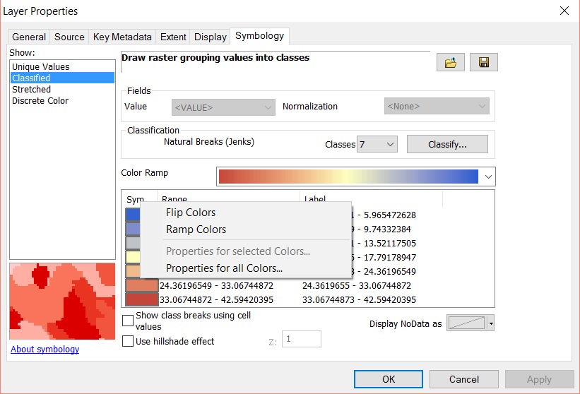
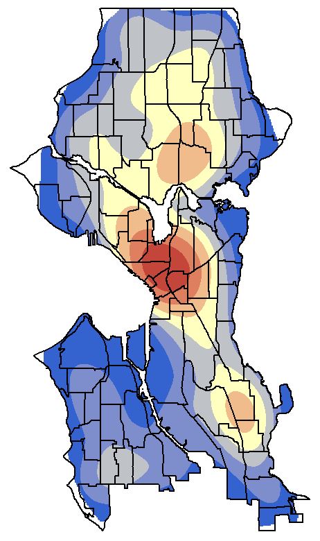
Open the Display tab and select Bilinear Interpolation from Resample during display dropdown menu. This will smoothen the contour look of the raster. Click OK to view the density surface. Turn on the neighborhoods and make the fill transparent with a black outline.

Density Raster

Alternatives

The Optimized Hotspot Analysis tool is a great place to start but it limits the analysis to default parameters set by the tool or calculated by the tool. For more advanced user control you can use the Hotspot Analysis (Getis-Ord Gi*) tool. You will need to use other tools such as Spatial Join to aggregate your data to polygons and create a Join_Count field, or the Create Fishnet tool to define a grid and then use Spatial Join. Remember to delete any grid cells that have a value of zero prior to running the hotspot analysis.

Getis-Ord Tool

See the resources below for more information on using Getis-Ord Gi* and what the parameters do especially in relation to the Conceptualization of Spatial Relationships parameter.

Hotspot Analysis with ArcGIS Resources

ArcGIS Optimized Hotspot Analysis
ArcGIS Mapping Cluster Toolset: Hot Spot Analysis

ArcGIS How Hot Spot Analysis Works
ArcGIS – Selecting a Conceptualization of Spatial Relationships: Best Practices

Crime Data for Seattle

Crime data was accessed using the ArcGIS REST API and the Socrata Open Data API from the https://data.seattle.gov website. I highly recommend getting your hands on Eric Pimplers ArcGIS Blueprints eBook for a look at exciting workflows with ArcPy and the ArcGIS REST API.

What is Hotspot Analysis?

Interested in learning ArcPy? check out this course.

Hotspot Analysis uses vectors to identify locations of statistically significant hot spots and cold spots in your data by aggregating points of occurrence into polygons or converging points that are in proximity to one another based on a calculated distance. The analysis groups features when similar high (hot) or low (cold) values are found in a cluster. The polygons usually represent administration boundaries or a custom grid structure.

HSA Polygons

Before performing hotspot analysis you need to test for the presence of clustering in the data with some prior analysis technique involving spatial autocorrelation which will identify if any clustering occurs within the entire dataset. Two available methods are Moran’s I (Global) and Getis-Ord General G (Global). Hotspot analysis requires the presence of clustering within the data. The two methods mentioned will return values, including a z-score, and when analysed together will indicate if clustering is found in the data or not. Data will need to be aggregated to polygons or point of incident convergence before performing the spatial autocorrelation analysis, see [An Introduction to] Hotspot Analysis using ArcGIS for an example using Moran’s I.

Hotspot Analysis is also known as Getis-Ord Gi* (G-I-star) which works by looking at each feature in the dataset within the context of neighbouring features in the same dataset. There may be a feature with a high value but it may not be a statistically significant hotspot. In order to be a significant hotspot a feature with a high value will be surrounded by other features with high values. Here’s some statistical talk from GISC

“The local sum for a feature and its neighbors is compared proportionally to the sum of all features; when the local sum is very different from the expected local sum, and that difference is too large to be the result of random choice, a statistically significant z-score results.”

A z-score and a p-value are returned for each feature in the dataset. What is a z-score and p-value? click here.

HSA Attribute Table

A high z-score and a low p-value for a feature indicates a significant hotspot. A low negative z-score and a small p-value indicates a significant cold spot. The higher (or lower) the z-score, the more intense the clustering. A z-score near 0 means no spatial clustering.

HSA Z & P Scores

The output of the analysis tells you where features of either high or low values cluster spatially. Scale is important, you might notice regional differences between the admin boundaries and the grid (below) and the method you choose will depend on your data and scale of analysis. According to Esri the minimum amount of features being analysed should be 30 as results are unreliable sub-30. When using the grid approach you should remove grid values of zero before performing the hotspot analysis.

HSA Polygons

When performing hotspot analysis make sure that your data is projected. Actually, when performing any statistical analysis processes that require distances it is important that your data is in a projected coordinate system that uses a unit of measurement. A popular projection is the UTM Zone that your data falls into which uses metres (m) as the unit of measurement.

Hot spot analysis is being utilized to help police identify areas with high crime rates, the types of crime being committed, and the best way to respond to these crimes. I like this quote from the Mapping Crime: Understanding Hotspots report issued by The National Institute of Justice (U.S)

“a hot spot is an area that has a greater than average number of criminal or disorder events, or an area where people have a higher than average risk of victimization.”

An area can be considered a hotspot if a higher than average occurrence of the the event being analysed is found in a cluster. And cooler to cold spots with less than average occurrences. The higher above the average with similar surrounding areas the ‘hotter’ the hotspot.

Examples of other areas where hot spot analysis is being used is epidemiology; where is the disease outbreak concentrated?, retail analysis, demographics voting pattern analysis, and controlling invasive species.

Note: Hotspot Analysis differs from a Heat Map. A Heat Map uses a raster where point data are interpolated to a surface showing the density or intensity value of occurrence. A colour gradient is applied where cells coloured by the lower end of the gradient represent low density and the higher end representing higher density. The colour gradient usually flows from cool to warm colours such as blues to yellow, orange and red. See Creating a Density Heat Map with Leaflet.

Tutorials

Hotspot Analysis using ArcGIS

Sources

Children’s Environmental Health Initiative
U.S. National Institute of Justice
Leaflet Essentials
GIS Lounge
National Criminal Justice Reference System
ArcGIS – How Hot Spot Analysis Works
GISC

Creating a Density Heat Map with Leaflet

Interested in learning ArcPy? check out this course.

A Heat Map is a way of representing the density or intensity value of point data by assigning a colour gradient to a raster where the cell colour is based on clustering of points or an intensity value. The colour gradient usually ranges from cool/cold colours such as hues of blue, to warmer/hot colours such as yellow, orange and hot red. When mapping the density of points that represent the occurrence of an event, a raster cell is coloured red when many points are in close proximity and blue when points are dispersed (if using the colour range above). Therefore, the higher the concentration of points in an area the greater the ‘heat’ applied to the raster. When mapping intensity, points are assigned an intensity value, the higher the value the hotter the colour assigned to the raster, with lower intensity values assigned cooler colours. Here, we will look at mapping density.

I have created a Python script that creates 250 randomized points in a localised area and 250 in a larger region covering Co. Kildare in Ireland. The script is at the bottom of the post. The output from the script is a GeoJSON file with the point data and also a JavaScript file with the point data. The reason for two files is that GeoJSON coordinates are long, lat while Leaflet points are lat,long. The JavaScript file will be used to create the heat map raster while the GeoJSON file will be used to add the points to the map as a vector.

Unrealistic Scenario: A mad scientist has cloned the Great Irish Elk from the DNA of a carcass and bred 500 of them, the animals grew smarter and escaped. They are beginning to get out of control as they wreak havoc across the land destroying local flora and fauna. Luckily the scientist had the foresight to tag each elk with a GPS tracker. Each point represents the current location of an individual elk. The heat map will aid hunters in focusing their attentions on saving the flowers and critters that dwell amongst them.

Let’s get started and begin to build the HTML file for creating the WebMap. The template below creates a WebMap using Leaflet panned and zoomed to Kildare with an OSM basemap.

Note: Wordpress doesn’t seem to like script or div tags in the code below so if using the code fix the space added to the tags.

Save the code below as a HTML file.

<!DOCTYPE html>
<html>
<head>
 <title>
  Heatmap with Leaflet
 </title>
 <!-- link to leaflet css --> 
 <link rel="stylesheet" href="http://cdn.leafletjs.com/leaflet-0.7.3/leaflet.css" />
 <!-- map is full width and height of device -->
 <meta name="viewport" content="width=device-width, maximum-scale=1.0, user-scalable=no" />
 <style>
  body{
   padding: 0;
   margin: 0;
  }
  html, body, #map {
   height: 100%;
  }
 </style>
</head>
<body>
 <!-- leaflet js -->
 < script src="http://cdn.leafletjs.com/leaflet-0.7.2/leaflet.js"></ script>
 < div id="map">
 </ div>
 < script>
  var map = L.map('map',{center: [53.15, -6.7], zoom: 10});
 
  // OSM Baselayer
  L.tileLayer('http://{s}.tile.osm.org/{z}/{x}/{y}.png').addTo(map);
 </ script>
 
</body>
</html>
Leaflet OSM

Click map to open in browser

We need to access two plugins, Leaflet.heat and Leaflet.ajax. Download leaflet-heat.js from here and leaflet.ajax.js from here and place them in the same directory as the HTML file. Leaflet.heat allows for the heat map to be generated while Leaflet.ajax enables adding GeoJSON data to the map from an external source. Add the following below the reference to leaflet.js in the <body>. Remember to correct the spaces in the script tags.

< script src="leaflet-heat.js"></ script>
< script src="leaflet.ajax.min.js"></ script>
< script src="heat_points.js"></ script>

The third script tag above accesses the heat_points.js file created by running the Python script. Make sure that this file is also in the same directory as your HTML file.

Next we add the boundary of Co. Kildare to the map. The data is stored in an external GeoJSON file. You can access this file here, if following this tutorial save the file to the same directory as your HTML. Before adding the polygon to the map we will define a style for it. Under the line that adds the OSM base layer add the following.

var kildareStyle = {
 "fillColor": "#CC9933", 
 "color": "#000000",
 "weight": 2, 
 "fillOpacity": 0.2
 };

This will style the Kildare polygon with a translucent brown fill and a black outline. Let’s add the polygon to the map using the Leaflet.ajax plugin…

var kildare = new L.GeoJSON.AJAX('kildare.geojson', {style:kildareStyle}).addTo(map);

Save your HTML and open in a browser. You will notice that the polygon has not been added. This is because the files need to be accessed via a server. There are two things you can do here. Add the files to a hosted server like this map that shows where the tutorial is currently at, or use Python to act as a server for you. Open up the command prompt and set the current working directory to where your files are located. Type in the following to the command prompt and press enter…

python -m SimpleHTTPServer

Open up a browser window and type 127.0.0.1:8000/ followed by the name of your html. For example 127.0.0.1:8000/leaflet_heatmap.htmlThe map should open with the Kildare GeoJSON polygon styled and added to the map like below.

Kildare GeoJSON

The map was set up for a desktop so you might need to zoom and pan if using a mobile device. Let’s add the heat layer to the map with one line of code. Place the following under the code that added the Kildare polygon.

var heat = L.heatLayer(heat_points, {radius:12,blur:25,maxZoom:11}).addTo(map);

heat_points in the code above refers to the heat_points variable stored in the heat_points.js file created from the Python script. You can get these points here. This allows us to easily access lat, long as required by Leaflet. Save your file and open in a browser via the Python server. radius is the size of the points, the blur value makes points merge more fluidly, a lower value creates individual points and extreme high values will lose all heat. maxZoom is the zoom level where the map looks best. Other options are minOpacity which is the opacity that the heat will start at, and gradient which allows you to define the colour gradient of the heat map e.g  {gradient: {.4:”blue”,.6:”cyan”,.7:”lime”,.8:”yellow”,1:”red”}}. For more information see Chapter 3 from Leaflet.js Essentials from Packt Publishing and the Leaflet.heat page.

Leaflet Heatmap

There is a high density of elk focused on a location in the west of Kildare indicating that the culling should begin there. Populated areas such as Leixlip, Prosperous, and  Kildare town should also be a priority.

To complete the map let’s add the GeoJSON points to the map. The GeoJSON point file can be accessed here. First we define a style, the code below will be a simple black dot for each elk. Place this code under the kildareStyle used to style the Kildare polygon.

var pointStyle = {
 radius: 2,
 fillColor: "#000000",
 color: "#000000",
 weight: 1,
 fillOpacity: 1
 };

We now use the Leafet.ajax plugin to add the data to the map and the pointToLayer option for a GeoJSON layer. Place the code below under the code that adds the Kildare polygon to the map.

var points = new L.GeoJSON.AJAX('points.geojson', {pointToLayer: function (feature, latlng) {
   return L.circleMarker(latlng, pointStyle);
 }}).addTo(map);

Save the HTML and open in your browser (via a server). Click on the map below to open a hosted version of this example in your browser.

Leaflet Elk Points

Those elks don’t stand a chance unless they learn to shoot lasers out of their antlers.

This was an introduction to creating a density Heat Map with Leaflet.js. Play around with the options; radius, blur, maxZoom etc. to understand how they effect the heatmap layer and use a search engine and the sources below for additional information.

Sources

Leaflet.js Essentials (Packt Publishing)
Calvin Metcalf
Vladimir Agafonkin

Python Script for Coordinate Generation

import random

# create a list of 500 points
coordinates = []

for coord in range(250):
 x1 = round(random.uniform(-7.1650,-6.4700),4)
 y1 = round(random.uniform(52.8320,53.4670),4)
 x2 = round(random.uniform(-7.0510,-7.0680),4) 
 y2 = round(random.uniform(53.1800,53.1960),4)

 point1 = [x1,y1]
 point2 = [x2,y2]
 
 coordinates.append(point1)
 coordinates.append(point2)

# open a geojson file to add the points to
# change the path to suit your setup
f = open("C:/blog/leaflet/points.geojson", "w")

# opening bracket
f.write('[')

count = 1

# add data to the geojson file (formatted)
for coord in coordinates:
 if count == 1:
  f.write('{\n \
  \t"type": "Feature",\n \
  \t"geometry": {\n \
  \t\t"type": "Point",\n \
  \t\t"coordinates": [' + str(coord[0]) + ',' + str(coord[1]) + ']\n \
  \t}\n \
  }')
 
  count = count + 1
 
 else:
  f.write(',{\n \
  \t"type": "Feature",\n \
  \t"geometry": {\n \
  \t\t"type": "Point",\n \
  \t\t"coordinates": [' + str(coord[0]) + ',' + str(coord[1]) + ']\n \
  \t}\n \
  }')
 
  count = count + 1

# closing bracket
f.write(']')
# close the file
f.close()

# open a JavaScript file to store coordinates in lat,long
# change the path to suit your setup
f2 = open("C:/blog/leaflet/heat_points.js", "w")
# create a variable
f2.write('var heat_points = [')

count = 1

# write data to js file
for coord in coordinates:
 if count == 1:
  f2.write('[' + str(coord[1]) + ',' + str(coord[0]) + ']')

  count = count + 1
 
 else:
  f2.write(',[' + str(coord[1]) + ',' + str(coord[0]) + ']')

  count = count + 1

# closing bracket
f2.write(']')
# close file
f2.close()

Haversine Distances with Python, EURO 2016 & Historic Results

Irish JerseyIreland kick off their European Championship 2016 Group E on the 13th of June at the Stade de France, Saint-Denis, in the northern suburbs of Paris at 6pm local time (5pm on the Emerald Isle). Our opponents that evening will be Sweden, followed by a trek down south to Bordeaux to face Belgium on the 18th, and then a northern journey to Lille to take on Italy in the final group game on the 22nd.

Euro 2016 Overview

Click on map to enlarge

I have a flight from Dublin to Paris, a train from Paris to Bordeaux, Bordeaux to Lille, Lille to Paris, and a flight back to Dublin. Let’s use the simple Haversine formula to calculate approximately how far I will be travelling to follow the boys in green this summer. Just to note, I am not being pessimistic by not sticking around for the knockout stages, I have every faith that we will get out of the group, a two week holiday in France is going to take its toll on the bank account! But who knows…

The Haversine formula calculates the distance between two points on a sphere, also known as the Greater Circle distance, here’s the Python code similar to rosettacode.org

from math import radians, sin, cos, sqrt, asin

def haversine(coords_1, coords_2):

 lon1 = coords_1[0]
 lat1 = coords_1[1]
 lon2 = coords_2[0]
 lat2 = coords_2[1]
 
 # Earth radius in kilometers
 earth_radius = 6372.8

 # convert from degrees to radians
 dLon = radians(lon2 - lon1)
 dLat = radians(lat2 - lat1) 
 lat1 = radians(lat1)
 lat2 = radians(lat2)

 # mathsy stuff for you to research...if you're so inclined to
 a = sin(dLat/2)**2 + cos(lat1)*cos(lat2)*sin(dLon/2)**2
 c = 2*asin(sqrt(a))

 # return the distance rounded to 2 decimal places
 return round((earth_radius * c),2)

Now to use the function to calculate my approximate travelling distance. First define the coordinates as lists.

# lon - lat
dub_airport = [-6.2700, 53.4214]
cdg_airport = [2.5478, 49.0097]
paris = [2.3831, 48.8390]
bordeaux = [-0.5800, 44.8400]
lille = [3.0583, 50.6278]

And then use the coordinates as parameters for the haversine function. Print the distance for each leg and the total distance.

leg_1 = haversine(dub_airport, cdg_airport)
print "Leg 1: " + str(leg_1) + " Km"

leg_2 = haversine(paris, bordeaux)
print "Leg 2: " + str(leg_2) + " Km"

leg_3 = haversine(bordeaux, lille)
print "Leg 3: " + str(leg_3) + " Km"

leg_4 = haversine(lille, paris)
print "Leg 4: " + str(leg_4) + " Km"

leg_5 = haversine(cdg_airport, dub_airport)
print "Leg 5: " + str(leg_5) + " Km"

total_dist = leg_1 + leg_2 + leg_3 + leg_4 + leg_5
print "Total Distance " + str(total_dist) + " Km"

The output from running the complete script is…

Leg 1: 785.3 Km
Leg 2: 498.57 Km
Leg 3: 698.71 Km
Leg 4: 204.79 Km
Leg 5: 785.3 Km
Total Distance 2972.67 Km

Just over 2,970 Km! Ok so I could have been more accurate with getting the road length from my house to the airport, using the Haversine to find the distance from Dublin Airport to Charles De Gaulle, and then using road and rail networks to calculate my internal travel in France but the idea here was to introduce you to the Haversine formula.

And here’s a little map to show my up coming travels. These maps were made by exporting data from ArcGIS as an emf and imported in CorelDraw, a graphic design package for styling.

Euro 2016 Travel

Click on the map to enlarge

That’s it for the Haversine, Python and GIS in general. If you have no interest in football you can stop reading here. From here down it’s just historic results against our opponents and opinions.

SWEDEN

IRE v SWE

We have faced Sweden in two world cup qualifying campaigns, in qualification for one European Championship, and four times in a friendly match. It doesn’t bode well that we have never beaten Sweden in a competitive game, losing four times and drawing twice.

vrs Sweden Competitive

Our dominance over Sweden in friendlies see us with a 75% win percentage, only losing once in four meetings.

v Sweden Friendlies

Overall: P10 W3 D2 L5 F13 A16 – WIN% 30

BELGIUM

BEL v IRE

Similar to our record against Sweden, Ireland have never beaten Belgium in a competitive fixture, although in the seven competitive games we have only been beaten twice, drawing the other five.

v Belgium Competitive

We have to look to the friendly results for Ireland to get the better of Belgium, with Ireland edging the score at four wins to three.

v Belgium Friendlies

Overall: P14 W4 D5 L5 F24 A25 – WIN% 28.57

ITALY

ITA v IRE

Well would you look at that!! We have beaten at least one of our upcoming opponents in a competitive match. Ok so one win out of eight but I am every the optimist and from 1994 onwards our record against Italy is pretty decent both competitively and in friendlies.

v Italy Competitive

Our overall record against Italy looks dismal but recent results give Ireland hope. Since and including our meeting with Italy at World Cup 94 the head-to-head is two wins each and three draws. If you offered my a draw now against Italy I’d take it. Remember there are now twenty-four teams in the competition meaning the best placed third team in each group qualifies for the second round.

v Italy Friendlies

Overall: P13 W2 D3 L8 F9 A20 – WIN% 16.67

Do we stand a chance of getting out of the group?

Let me know your thoughts. With three teams qualifying from four out of the six groups Ireland have every chance of progressing. A win and a draw will more than likely be the minimum requirement to achieve passage to the next phase, but let’s not forget that Ireland reached the Quarter Finals of Italia 90 having not won a single match! Beat Sweden in the opener and get a draw against Italy. If only it was that simple 🙂

#COYBIG

Data used to create maps was downloaded from Natural Earth.
Historic results collate from the FAI and Wikipedia.

CSV to Shapefile with pyshp

Interested in learning ArcPy? check out this course.

In this post I will look at extracting point data from a CSV file and creating a Shapefile with the pyshp library. The data consists of the location of trees with various attributes generated by the Fingal County Council in Ireland. The data can be downloaded as a CSV file from dublinked.ie.

pyshp is a pure Python library designed to provide read and write support for the ESRI Shapefile (.shp) format and only utilizes Python’s standard library to achieve this. The library can be downloaded from https://code.google.com/p/pyshp/ and placed in the site-packages folder of your Python installation. Alternatively you can use easy-install…

easy_install pyshp

…or pip.

pip install pyshp

NOTE: You should make yourself familiar with the pyshp library by visiting Joel Lawhead’s examples and documents here.

The full code is at the bottom of the post, the following is a walkthrough. When ready to go open your favourite editor and import the modules required for the task at hand.

import shapefile, csv

We will use the getWKT_PRJ function discussed in a previous post.

def getWKT_PRJ (epsg_code):
 import urllib
 wkt = urllib.urlopen("http://spatialreference.org/ref/epsg/{0}/prettywkt/".format(epsg_code))
 remove_spaces = wkt.read().replace(" ","")
 output = remove_spaces.replace("\n", "")
 return output

Create an instance of the Shapefile Writer( ) class and declare the POINT geometry type.

trees_shp = shapefile.Writer(shapefile.POINT)

Set the autoBalance to 1. This enforces that for every record there must be a corresponding geometry.

trees_shp.autoBalance = 1

Create the field names and data types for each.

trees_shp.field("TREE_ID", "C")
trees_shp.field("ADDRESS", "C")
trees_shp.field("TOWN", "C")
trees_shp.field("TREE_SPEC", "C")
trees_shp.field("SPEC_DESC", "C")
trees_shp.field("COMMONNAME", "C")
trees_shp.field("AGE_DESC", "C")
trees_shp.field("HEIGHT", "C")
trees_shp.field("SPREAD", "C")
trees_shp.field("TRUNK", "C")
trees_shp.field("TRUNK_ACTL", "C")
trees_shp.field("CONDITION", "C")

Create a counter variable to keep track of the number of feature written to the Shapefile.

counter = 1

Open the CSV file in read mode.

with open('C:/csv_to_shp/Trees.csv', 'rb') as csvfile:
 reader = csv.reader(csvfile, delimiter=',')

Skip the header.

next(reader, None)

Loop through each row and assign each attribute in the row to a variable.

for row in reader:
 tree_id = row[0]
 address = row[1]
 town = row[2]
 tree_species = row[3]
 species_desc = row[4]
 common_name = row[5]
 age_desc = row[6]
 height = row[7]
 spread = row[8]
 trunk = row[9]
 trunk_actual = row[10]
 condition = row[11]
 latitude = row[12]
 longitude = row[13]

Set the geometry for each record based on the longitude and latitude vales.

trees_shp.point(float(longitude),float(latitude))

Create a matching record for the geometry using the attributes.

trees_shp.record(tree_id, address, town, tree_species, species_desc, common_name, age_desc,height, spread, trunk, trunk_actual, condition)

Print to screen the current feature number and increase the counter.

print "Feature " + str(counter) + " added to Shapefile."
 counter = counter + 1

Save the Shapefile to a location and name the file.

trees_shp.save("C:/csv_to_shp/Fingal_Trees")

Create a projection file (.prj)

prj = open("C:/csv_to_shp/Fingal_Trees.prj", "w")
epsg = getWKT_PRJ("4326")
prj.write(epsg)
prj.close()

Save and run the script. The number of features should be printed to the console.

Number of features

If you open the original CSV file you can see that there are also 33670 records. Navigate to the file location where you saved the Shapefile output. You should see four files shown below.

Shapfile

And just to make sure that the data is correct, here I have opened it up in QGIS.

QGIS - Fingal Trees

And the attribute table…

QGIS Attribute Table

And here’s the full code…

# import libraries
import shapefile, csv

# funtion to generate a .prj file
def getWKT_PRJ (epsg_code):
 import urllib
 wkt = urllib.urlopen("http://spatialreference.org/ref/epsg/{0}/prettywkt/".format(epsg_code))
 remove_spaces = wkt.read().replace(" ","")
 output = remove_spaces.replace("\n", "")
 return output

# create a point shapefile
trees_shp = shapefile.Writer(shapefile.POINT)

# for every record there must be a corresponding geometry.
trees_shp.autoBalance = 1

# create the field names and data type for each.
trees_shp.field("TREE_ID", "C")
trees_shp.field("ADDRESS", "C")
trees_shp.field("TOWN", "C")
trees_shp.field("TREE_SPEC", "C")
trees_shp.field("SPEC_DESC", "C")
trees_shp.field("COMMONNAME", "C")
trees_shp.field("AGE_DESC", "C")
trees_shp.field("HEIGHT", "C")
trees_shp.field("SPREAD", "C")
trees_shp.field("TRUNK", "C")
trees_shp.field("TRUNK_ACTL", "C")
trees_shp.field("CONDITION", "C")

# count the features
counter = 1

# access the CSV file
with open('C:/csv_to_shp/Trees.csv', 'rb') as csvfile:
 reader = csv.reader(csvfile, delimiter=',')
 # skip the header
 next(reader, None)

#loop through each of the rows and assign the attributes to variables
 for row in reader:
  tree_id = row[0]
  address = row[1]
  town = row[2]
  tree_species = row[3]
  species_desc = row[4]
  common_name = row[5]
  age_desc = row[6]
  height = row[7]
  spread = row[8]
  trunk = row[9]
  trunk_actual = row[10]
  condition = row[11]
  latitude = row[12]
  longitude = row[13]

  # create the point geometry
  trees_shp.point(float(longitude),float(latitude))
  # add attribute data
  trees_shp.record(tree_id, address, town, tree_species, species_desc, common_name, age_desc,height, spread, trunk, trunk_actual, condition)

  print "Feature " + str(counter) + " added to Shapefile."
  counter = counter + 1

# save the Shapefile
trees_shp.save("C:/csv_to_shp/Fingal_Trees")

# create a projection file
prj = open("C:/csv_to_shp/Fingal_Trees.prj", "w")
epsg = getWKT_PRJ("4326")
prj.write(epsg)
prj.close()

Any problems let me know.