
Interested in learning ArcPy? check out this course.
Hotspot Analysis uses vectors to identify locations of statistically significant hot spots and cold spots in your data by aggregating points of occurrence into polygons or converging points that are in proximity to one another based on a calculated distance. The analysis groups features when similar high (hot) or low (cold) values are found in a cluster. The polygons usually represent administration boundaries or a custom grid structure.

Before performing hotspot analysis you need to test for the presence of clustering in the data with some prior analysis technique involving spatial autocorrelation which will identify if any clustering occurs within the entire dataset. Two available methods are Moran’s I (Global) and Getis-Ord General G (Global). Hotspot analysis requires the presence of clustering within the data. The two methods mentioned will return values, including a z-score, and when analysed together will indicate if clustering is found in the data or not. Data will need to be aggregated to polygons or point of incident convergence before performing the spatial autocorrelation analysis, see [An Introduction to] Hotspot Analysis using ArcGIS for an example using Moran’s I.
Hotspot Analysis is also known as Getis-Ord Gi* (G-I-star) which works by looking at each feature in the dataset within the context of neighbouring features in the same dataset. There may be a feature with a high value but it may not be a statistically significant hotspot. In order to be a significant hotspot a feature with a high value will be surrounded by other features with high values. Here’s some statistical talk from GISC…
“The local sum for a feature and its neighbors is compared proportionally to the sum of all features; when the local sum is very different from the expected local sum, and that difference is too large to be the result of random choice, a statistically significant z-score results.”
A z-score and a p-value are returned for each feature in the dataset. What is a z-score and p-value? click here.

A high z-score and a low p-value for a feature indicates a significant hotspot. A low negative z-score and a small p-value indicates a significant cold spot. The higher (or lower) the z-score, the more intense the clustering. A z-score near 0 means no spatial clustering.

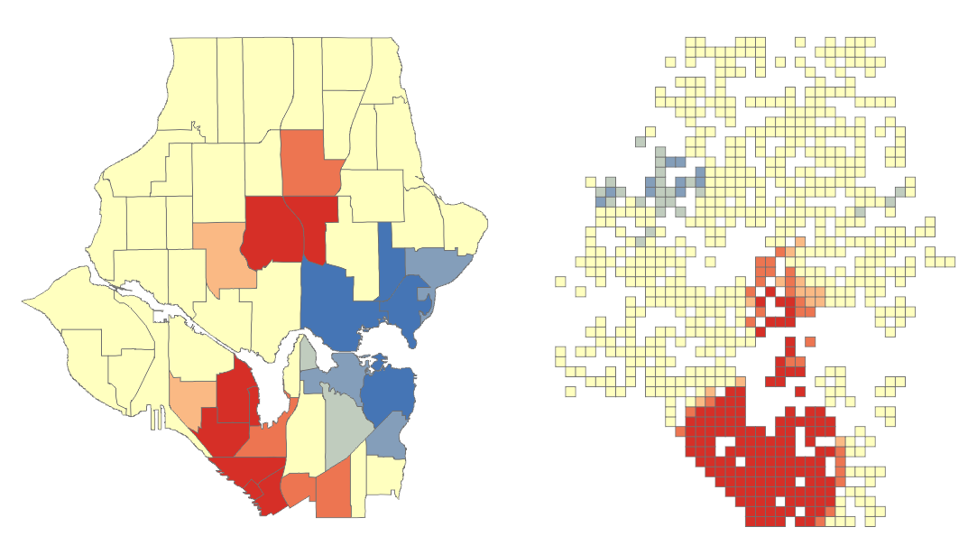
The output of the analysis tells you where features of either high or low values cluster spatially. Scale is important, you might notice regional differences between the admin boundaries and the grid (below) and the method you choose will depend on your data and scale of analysis. According to Esri the minimum amount of features being analysed should be 30 as results are unreliable sub-30. When using the grid approach you should remove grid values of zero before performing the hotspot analysis.
When performing hotspot analysis make sure that your data is projected. Actually, when performing any statistical analysis processes that require distances it is important that your data is in a projected coordinate system that uses a unit of measurement. A popular projection is the UTM Zone that your data falls into which uses metres (m) as the unit of measurement.
Hot spot analysis is being utilized to help police identify areas with high crime rates, the types of crime being committed, and the best way to respond to these crimes. I like this quote from the Mapping Crime: Understanding Hotspots report issued by The National Institute of Justice (U.S)
“a hot spot is an area that has a greater than average number of criminal or disorder events, or an area where people have a higher than average risk of victimization.”
An area can be considered a hotspot if a higher than average occurrence of the the event being analysed is found in a cluster. And cooler to cold spots with less than average occurrences. The higher above the average with similar surrounding areas the ‘hotter’ the hotspot.
Examples of other areas where hot spot analysis is being used is epidemiology; where is the disease outbreak concentrated?, retail analysis, demographics voting pattern analysis, and controlling invasive species.
Note: Hotspot Analysis differs from a Heat Map. A Heat Map uses a raster where point data are interpolated to a surface showing the density or intensity value of occurrence. A colour gradient is applied where cells coloured by the lower end of the gradient represent low density and the higher end representing higher density. The colour gradient usually flows from cool to warm colours such as blues to yellow, orange and red. See Creating a Density Heat Map with Leaflet.
Tutorials
Sources
Children’s Environmental Health Initiative
U.S. National Institute of Justice
Leaflet Essentials
GIS Lounge
National Criminal Justice Reference System
ArcGIS – How Hot Spot Analysis Works
GISC

Pingback: [An Introduction to] Hotspot Analysis Using ArcGIS | Geospatiality
Pingback: Book Review: The ESRI Guide to GIS Analysis Vol. 2: Spatial Measurements & Statistics | Geospatiality
Pingback: Il software italiano che ha cambiato il mondo della polizia predittiva
Pingback: Il software italiano che ha cambiato il mondo della polizia predittiva - Omnia Gate
Pingback: Il software italiano che ha cambiato il mondo della polizia predittiva | NUTesla | The Informant
Pingback: Il software italiano che ha cambiato il mondo della polizia predittiva | Finanza Prime